
AI Mysteries
A guide to publication-quality data visualization using Proplot
Proplot is a wrapper of the matplotlib library for the visualization of data.

Proplot is a wrapper of the matplotlib library for the visualization of data.

In the context of analytics, data visualization is critical because it allows users or clients to view large amounts of data and simultaneously extract important insights that can propel the business forward.

Let’s compare two popular data visualization platform, Google Data Studio and Tableau
From this article you can learn how to plot Geospatial data.
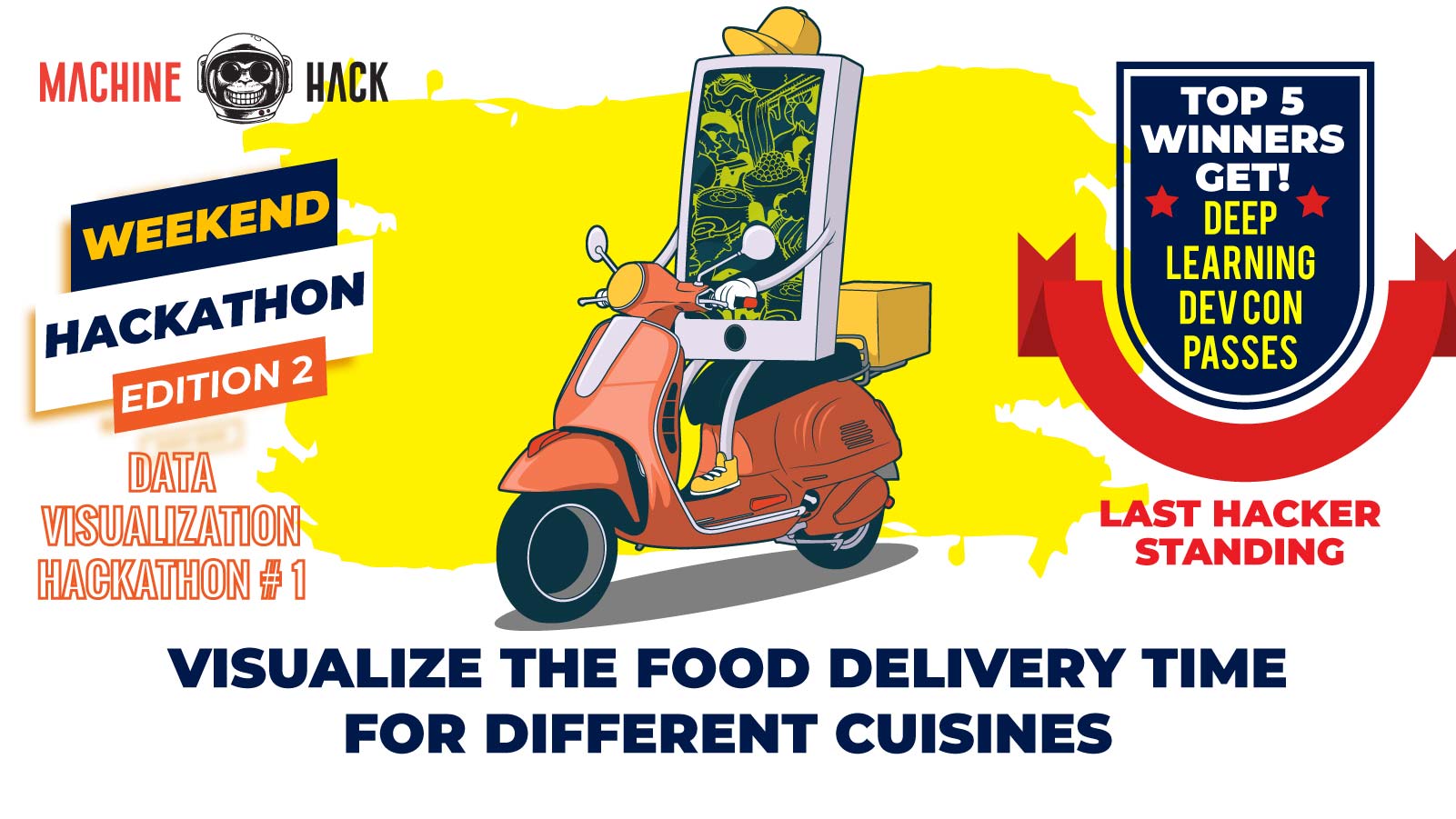
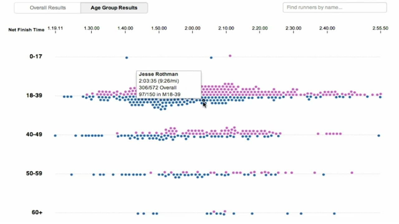
In this hackathon, the data science community needs to visualise the food delivery time for different cuisines.

Pandas Visual Analysis is an open-source python library which is used to visually analyze the data and that too in just a single line of code. It creates a user interface that can be used to create different plots and graphs taking different attributes.

Altair creates highly interactive and informative visualizations so that we can spend more time in understanding the data we are using and it’s meaning.

By the advancements of technology, we are generating huge amounts of data in multiple ways. The data generated from the origin of the earth to

In this article, we will explore Folium, a python library which is used to create different types of geographical data visualizations. We will try and create different types of maps and markers on maps.

Amid a barrage of information on Covid-19, processing the relevant material can be challenging. While some have completely disconnected themselves from the news cycle, others

It is no surprise that data visualization plays an important role in the data science domain. It is not easy to monitor and tweak data

Deloitte this month announced the launch of a first-of-its-kind public data visualization tool, Open Source Compass (OSC) intended to help C-suite leaders, product managers and
In one of our recent articles, we introduced Tableau and how to start making visualizations. In this article, we will look at another popular BI
Data Visualization tools are of great importance in the analytics industry as they give a clear idea of the complex data involved. Python is one

There is nothing more powerful than a beautiful visualization. The effect of an intuitive visualization is far more satisfying than looking at a large table

Data visualization gives many insights that data alone cannot. Python has some of the most interactive data visualisation tools. The most basic plot types are

We have written extensively about Data Visualisation in the past and BI tools have been playing a crucial role in the present day businesses and

There are various types of data visualisations that a data science enthusiast can play with — charts, graphs, maps, infographics, etc — but sometimes it

Most of the jobs that fall under the “fastest-growing” category, especially in the tech sector, did not even exist a few years ago. Job surveys

Google Fusion Tables, commonly used by data journalists will soon be shut down by Google. The announcement came on December 11 when the Mountain View

The Duke of Wellington famously said, “I used to say of him [Napoleon] that his presence on the field made the difference of forty thousand

Two of the most popular data visualization tools, Tableau and Qlikview are easily the most widely used tools when it comes to interpreting complicated data

It’s the world of data and with the ever increasing websites, smart devices and smart technologies connected over the internet, the amount of data generated

Big data means big elections and Hyderabad-based Gramener, the Data Visualization & Analytics platform provider, is no stranger to the election frenzy. It was Gramener’s

Geospatial analysis can essentially be described as the gathering, display, and manipulation of imagery, GPS, satellite photography, and historical data. This information is usually represented

The aim behind this blog post is to introduce open source business intelligence technologies and explore data using open source technologies like D3.js, DC.js, Node
Data visualization is nothing but “How to tell stories with Data” or “Helping audience to understand, which sometimes otherwise difficult to see” or “Capturing an

Founded in 2010, Gramener help our clients unlock hidden insights from data, and using our cutting-edge visualisations develops foresight for critical business decisions. We work

Consider this price and sales table for four cities: Can you figure out how each city is performing? Notice that the average for each

For decades, professionals have used traditional visualization tools like Bar charts, scatter graphs, and maps to envisage meaningful information. This is bound to be challenged

Join the forefront of data innovation at the Data Engineering Summit 2024, where industry leaders redefine technology’s future.