Management books and gurus scream “prioritize or perish.”
Do enterprises know their priorities – not just directional priorities but daily priorities that need to be acted upon? In ever changing dynamic business environment, are the enterprise resources being spend on priorities which matter?
Identification of priorities need to happen at the speed of market force changes – be it competition, regulations, politics, economy or technological disruptions. Enterprises are not monolithic constructs where information flow does not have any loss in translation. In fact, enterprises are made of human beings who are very diverse in their skills, roles, locations, dispositions and motivations. These human beings are the ones who need to employ the right resources for the right priorities to ensure enterprise effectiveness. Hence helping them understand the priorities is the first step; if they understand, they are likely to act on them.
Of late, organizations face voluminous data that hit them at velocities that are difficult to consume. Leaders and teams look at the same data and perceive different priorities based on their cognitive ability. This problems is more acute in large, distributed, multi-tiered and complex organizations which span across nations.
So there has to be a simple tool which represents data in a manner where the priorities become evident for all without having to spend too much effort in understanding or translating it for others. Visualization tools which represents both data and insights in a simple manner (pictures of data) is one such tool. If there is a way for someone to understand the daily actionable priorities irrespective of how disconnected they are from the data; it revolutionizes organizational effectiveness.
Case in point is one of our customers whose sales teams are distributed across geographies and who sell products at various levels of daily discounts based on markets and competition. Conveying to these teams their daily priorities based on ever changing market conditions can reek of confusion and ineffectiveness unless they get clear & unambiguous directives. These directives can be deftly conveyed with the help of visualization tools.
There are several examples where visualizations have helped leaders and teams prioritize the most impactful actions from data deluge which were masking the key priorities before. A few examples of such visualizations are discussed below:
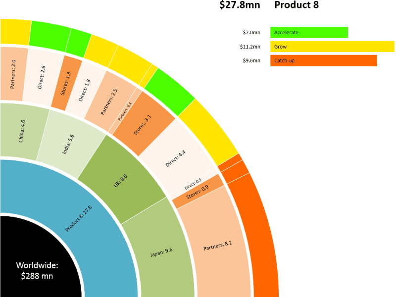
Figure 1: Consumer Products Weekly Output. Cleary shows that “orange” needs attention.
A large consumer products company with over 35 products and with 3 channels – Direct, Stores and Partners, needed to have weekly priorities and actions identified. They come together as a team on Monday morning conference calls. Not only the data was voluminous, data changed every week and priorities were hard to decipher and convey. The simple visualization (Figure 1) “where to focus” was understood by all. Focus on the “orange” essentially prepared everyone for action without loss in translation. Week on weekly when such visualization outputs were given, priorities became evident for all. Conversations and confusions were lesser; effectiveness higher.

Figure 2: Loan Portfolio Defaulters. “Personal and Foreign” needs prioritized attention.
A leading bank wants to act on the loan defaulters fast. “Personal” and ”Foreign”needs immediate attention. Also there are some items like “LG” which needs pre-emptive actions. Not much time is wasted in conveying these and actions needed squarely falls on people responsible for it since they understood these priorities clearly.

Figure 3: Far East, Deep South & Far North are the priorities
Geographical distribution of any parameter on a map clearly conveys which items are beyond threshold and which are within tolerance limits. Far East, Deep South and Far North immediate attention becomes evident for all.

Figure 4: Here, on one dashboard several parameters have been represented. A second group of boxes are further breakdown of the groups in the first line. A few things are clear from this visual, “Renewal Revenues” are falling (loss of existing customers) and “Activation Count” are also falling (new customer acquisition are slowing down).

Figure 5: Wednesday Sales is a concern.
Sales revenue of this food industry giant is below average on all Wednesdays. It is evident from this visual that the company need to reprioritize Wednesday sales strategies.


Figure 6: Air quality comparison between 2 days. Left: Week Days, Right: Weekend
Air quality comparison between 2 days of a city clearly shows Weekdays around 9 AM and around 6 AM needs prioritized attention from the authorities.
In all the above examples, with the help of simple visualizations the priorities were conveyed which helped all to understand where the focus should be. All these examples are non-intrusive – as in, Gramener did not expect customer’s to change anything at their end – be it workflow, be it data collection & dissemination, be it technology. Gramener simply used the existing data and provided visualizations for quick prioritization.