Plotly Express is a free and open-source Python visualization library for creating interactive and beautiful visualizations. It’s a great way to find patterns in a dataset before diving into machine learning modelling. In this article, we will look at how to use it in an example-driven way, giving you an overview of Plotly Express using the built-in datasets, explaining it from the ground up, and covering all of the most commonly used charts. The following are the points and plots that this article will cover.
Table of Contents
- About Plotly Express
- Visualization With Plotly Express
- Basic Charts
- Tree Maps
- 3D Plot
- Multi-Dimensional Plot
- Polar Charts
Let’s start the discussion by understanding what is Plotly Express?
About Plotly Express
Plotly Express is a new Python visualization library that acts as a wrapper for Plotly, exposing a simple syntax for complex charts. It was inspired by Seaborn and ggplot2 and was specifically designed to have a terse, consistent, and easy-to-learn API: with a single import, you can make richly interactive plots with faceting, maps, animations, and trendlines in a single function call.
Plotly Express, like Plotly.py, includes on-board datasets, colour scales, and themes, and it’s completely free with the permissive open-source MIT license, you can use it however you want (yes, even in commercial products!). Plotly Express is fully compatible with the rest of the software.
Plotly Express is a plotly.express module (usually imported as px) that contains functions that can create entire figures at once. Plotly Express is a part of the Plotly library that comes pre-installed and is the recommended starting point for most common figures. Every Plotly Express function returns a plotly.graph object.figure instance and uses graph objects internally.
Plotly Express includes over 30 functions for creating various types of figures. The API for these functions was carefully designed to be as consistent and easy to learn as possible, allowing you to easily switch from a scatter plot to a bar chart to a histogram to a sunburst chart during a data exploration session.
Visualization with Plotly Express
Basic Charts
Let us have a look at how the basic plots can be created using Plotly express.
Scatter Plot
Scatterplots are excellent for determining whether two numerical variables have a relationship or correlation. Each data point is represented as a marker point by px.scatter, whose location is determined by the x and y columns.
! pip install plotly
import plotly.express as px
df = px.data.iris()
fig = px.scatter(df, x="sepal_width", y="sepal_length", color="species")
fig.show()

With the trendline argument in Plotly Express, you can add an Ordinary Least Squares regression trendline to scatter plots. Marginal distribution plots, which are small subplots above or to the right of the main plot and show the distribution of data along only one dimension, can also be used. Plotly Express functions like scatter and histogram have marginal distribution plot capabilities built-in.
fig = px.scatter(df, x="sepal_width", y="sepal_length", color="species", marginal_y="violin",
           marginal_x="box", trendline="ols", template="simple_white")
fig.show()

Bar Plot
When displaying a categorical column and a numerical column, a Bar Plot is an excellent visualization. It displays the number of a specific numerical column in each category. Plotly Express makes it very simple to create one.
import plotly.express as px
df = px.data.tips()
fig = px.bar(df, x="sex", y="total_bill", color="smoker", barmode="group")
fig.show()

Histogram
A graphical representation of a binned numerical data distribution is a histogram. The count for each bin is then displayed. Aggregation functions such as sum and average can be used to combine plotly data. The data to be binned in Plotly can also be categorical. Here’s an illustration:
import plotly.express as px
df = px.data.tips()
fig = px.histogram(df, x="total_bill", color="sex")
fig.show()

Tree Maps
Sunburst Chart
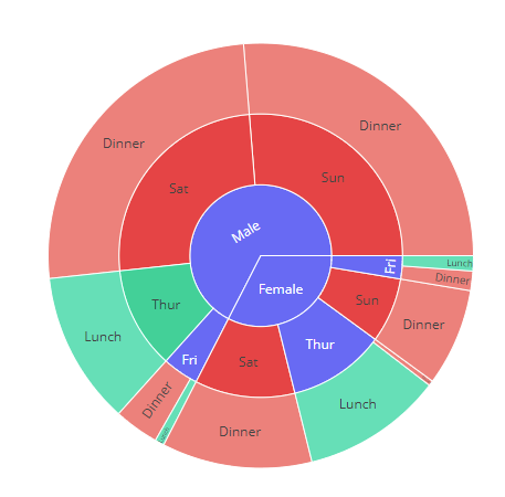
Sunburst plots depict hierarchical data that extends radially from root to leaves. Labels and parents’ attributes define the hierarchy. Children are added to the outer rings as the root grows from the center. Each row of the DataFrame is represented as a sector of the sunburst by px.sunburst.
df = px.data.tips()
fig = px.sunburst(df, path=['sex', 'day', 'time'], values='total_bill', color='time')
fig.show()

Funnel Chart
Funnel charts are frequently used to visualize data at various stages of a business process. It’s a crucial mechanism in Business Intelligence for identifying potential process flaws. It’s used to track revenue or loss in a sales process at each stage, for example, and it shows values that are decreasing over time. Each stage is represented by a percentage of the total value.
data = dict(
    number=[39, 27.4, 20.6, 11, 2],
    stage=["Website visit", "Downloads", "Potential customers", "Requested price", "invoice sent"])
fig = px.funnel(data, x='number', y='stage')
fig.show()

3D Plots
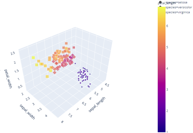
The 3D function px.scatter 3d plots individual data in three-dimensional space, similar to the 2D scatter plot px.scatter.
df = px.data.iris()
fig = px.scatter_3d(df, x='sepal_length', y='sepal_width', z='petal_width',
              color='petal_length', size='petal_length', size_max=18,
              symbol='species', opacity=0.7)

# tight layout
fig.update_layout(margin=dict(l=0, r=0, b=0, t=0))

Multidimensional Plot
Scatter Matrix
A scatterplot matrix is a matrix that is linked to n numerical arrays (data variables) of the same length, $X1, X2,…, X n$. The scatter plot of the variable Xi versus Xj is displayed in cell (i,j) of such a matrix.
To plot the scatter matrix for the columns of the data frame, use the Plotly Express function px.scatter matrix. By default, all columns are taken into account.
df = px.data.iris()
fig = px.scatter_matrix(df,
    dimensions=["sepal_width", "sepal_length", "petal_width", "petal_length"],
    color="species")
fig.show()

Parallel Coordinates Plot
Each row of the DataFrame is represented by a polyline mark that traverses a set of parallel axes, one for each dimension,
df = px.data.iris()
fig = px.parallel_coordinates(df, color="species_id", labels={"species_id": "Species",
                "sepal_width": "Sepal Width", "sepal_length": "Sepal Length",
                "petal_width": "Petal Width", "petal_length": "Petal Length", },
                             color_continuous_scale=px.colors.diverging.Tealrose,
                             color_continuous_midpoint=2)
fig.show()

Polar Charts
Scatter Polar Plot
Data is represented on radial and angular axes in a polar chart. Polar data can be represented as scatter markers with px.scatter polar and as lines with px.line polar in Plotly Express. The r and theta arguments of px.scatter polar are used to specify radial and angular coordinates. Theta data are categorical in the example below, but numerical data are also possible and the most common cause.
df = px.data.wind()
fig = px.scatter_polar(df, r="frequency", theta="direction",
                       color="strength", symbol="strength", size="frequency",
                       color_discrete_sequence=px.colors.sequential.Plasma_r)
fig.show()

Final Words
With the help of interactive features, we can even dig deeper into our dataset and can grab more information straightway. With the Plotly Express, in this post we have some of the commonly used plots in a community like a bar chart, scatter plot, histogram. More interestingly, I also saw some of the fancy plots like polar chart, parallel coordinates chart, sunburst chart, funnel chart which can grab more information in the granular way of your data.


