

Data visualization assists to tell the story about the data more efficiently and makes it presentable. Sometimes it is difficult to explain the variation in the data with a static chart, for this, there are animation libraries. In this article, we will be discussing one of the animation libraries offered by matplotlib named “Animation”. Following are the topics to be covered.
Table of contents
- Brief description of Matplotlib
- Animated plots
- Line plot
- Surface plot
- Regression plot
Let’s start with a brief introduction to Matplot.
Brief description of Matplotlib
Probably the most popular Python two-dimensional plotting library in python is Matplolib. Most people start their exploratory data analysis journey with Matplotlib. It makes it easy to create plots, histograms, bar charts, scatterplots, etc. As well as Pandas and Seaborn, it integrates seamlessly to create even more sophisticated visuals. After all these goods there are some flaws in it which are:
- Matplotlib has an imperative API which is often overly verbose.
- Sometimes poor stylistic defaults.
- Poor support for web and interactive graphs.
- Often slow for large & complicated data.
Let’s start animating some plots and observing the visualization.
Are you looking for for a complete repository of Python libraries used in data science, check out here.
Line plots
Let’s see how to plot an animated sine and cosine wave using a line plot.
Import necessary libraries:
import matplotlib.animation as anime
import matplotlib.pyplot as plt
import numpy as np
import pandas as pd
Code for animation:
fig=plt.figure()
l, =plt.plot([],[],'k-')
l2, = plt.plot([], [], 'm--')
p1, = plt.plot([], [], 'ko')
p2, = plt.plot([], [], 'mo')
plt.xlabel('xlabel')
plt.ylabel('ylabel')
plt.title('title')

plt.xlim(-5, 5)
plt.ylim(-5, 5)

def func(x):
  return np.sin(x)*3
def func2(x):
    return np.cos(x)*3

metadata=dict(title="Movie",artist="sourabh")
writer= anime.PillowWriter(fps=15,metadata=metadata)

xlist=[]
ylist=[]
ylist2 = []
xlist2 = []
with writer.saving(fig,"sin+cosinewave.gif",100):
    for xval in np.linspace(-5,5,100):
        xlist.append(xval)
        ylist.append(func(xval))

        l.set_data(xlist,ylist)
        l2.set_data(xlist2,ylist2)

        p1.set_data(xval,func(xval))

        writer.grab_frame()
    for xval in np.linspace(-5,5,100):
        xlist2.append(xval)
        ylist2.append(func2(xval))

        l.set_data(xlist,ylist)
        l2.set_data(xlist2,ylist2)

        p2.set_data(xval,func2(xval))

        writer.grab_frame()
In the above line of codes initially a blank plot is been created then the x-axis and y-axis limits are set between -5 to 5, creating functions for the sine and cosine wave. Used a package named ‘Pillowwriter’ which will help to create a gif for the animated plot and the rest is creating data for the function and plotting those data. The gif could be stored on your drives by using “with writer.saving(figure, “name of the plot.gif”,dpi for the gif)”.

In this plot, the bold line is the sine wave and the dotted line is the cosine wave.
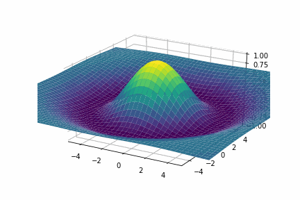
Surface plot
A surface plot displays the three-dimensional relationship in two dimensions, with the variables on the x- and y-axes, and the response variable (z) represented by a smooth surface. It is generally used when studying the fitting of the model with two or more continuous features.
Import libraries:
import matplotlib
from matplotlib import cm
import matplotlib.animation as anime
import matplotlib.pyplot as plt
import numpy as np
import pandas as pd
Code for animation:
np.random.seed(29680801)

fig, ax = plt.subplots(subplot_kw=dict(projection='3d'))

plt.xlim(-5, 5)
plt.ylim(-5, 5)

metadata=dict(title="Movie",artist="sourabh")
writer= anime.PillowWriter(fps=15,metadata=metadata)

def func(x,y,r,t):
    return np.cos(r/2+t)*np.exp(-np.square(r)/50)

xdata = np.linspace(-10, 10, 1000)
ydata = np.linspace(-10, 10, 1000)

x_list, y_list = np.meshgrid(xdata, ydata)

r_list = np.sqrt( np.square(x_list) + np.square(y_list) )

with writer.saving(fig, "exp3d.gif", 100):
    for t in np.linspace(0,20,160):
        z = func(x_list,y_list,rlist, t)
        ax.set_zlim(-1, 1)
        ax.plot_surface(x_list,y_list,z,cmap=cm.viridis)

        writer.grab_frame()
        plt.cla()
As for creating a three-dimensional plot, we need x,y, and z so for the z value created a function that will calculate the value based on the values of the x-axis, y-axis as well the square root of them.
Regression plot
np.random.seed(23680545)

metadata=dict(title="Movie",artist="sourabh")
writer= anime.PillowWriter(fps=15,metadata=metadata)

fig = plt.figure()
plt.xlim(-8, 8)
plt.ylim(-8, 8)


def func(x):
    return x*1.2 + 0.1 + np.random.normal(0,2, x.shape)

x = np.random.uniform(-7,7,10)
x = np.sort(x)
y = func(x)

coeff = np.polyfit(x,y,1)
print(coeff)
xline = np.linspace(-6,6,40)
yline = np.polyval(coeff, xline)

lPnt, = plt.plot(x, y, 'o')
l, = plt.plot(xline, yline, 'k-', linewidth=3)

plt.show()


fig = plt.figure()
plt.xlim(-10, 10)
plt.ylim(-10, 10)

lPnt, = plt.plot([], [], 'o')
l, = plt.plot([], [], 'k-', linewidth=3)

x_List = []
y_List = []

x_pnt = []
y_pnt = []


with writer.saving(fig, "fitPlot.gif", 100):


    for xval,yval in zip(x,y):

        x_pnt.append(xval)
        y_pnt.append(yval)

        lPnt.set_data(x_pnt,y_pnt)
        l.set_data(x_List,y_List)


        writer.grab_frame()
        writer.grab_frame()


    for x_val,y_val in zip(xline,xline):

        x_List.append(x_val)
        y_List.append(y_val)

        lPnt.set_data(x_pnt,y_pnt)
        l.set_data(x_List,y_List)

        writer.grab_frame()


    for i in range(10):
        writer.grab_frame()
In this plot, we help to understand the explanation of fitting of regression learner line more dynamically.
Final Words
Matplotlib could be the oldest library for data visualization or you can call it the grandfather of data visualization but it is a powerful tool to visualize the data dynamically and efficiently. With a hands-on implementation of this concept in this article, we could understand how to animate a two-dimensional plot.