Visualization of the data plays a crucial role in the majority of data analytics tasks. The ggplot package of the R programming language makes the R richer on the side of data visualization. In python as well, various packages are also available for data visualization. If the features and capabilities of ggplot can be used in python, it will be a valuable advantage in many visualization specific tasks. In this article, we are going to explore how we can use ggplot in python for visualizing data using a package named plotnine that is based on ggplot2. The major points to be discussed in the article are listed below.
Table of content
- What is ggplot?
- First plot
- Factorization of datapoints
- Ggplot with pandas data frame
Let’s begin with having a brief introduction to ggplot.
What is ggplot?
We mainly know ggplot as a package used in R for data visualizations. This package is responsible for making R one of the best tools in the world of data visualization. This package is created by Hadley Wickham and can be considered as an implementation of the grammar of graphics suggested by Leland Wilkinson.
Grammar of graphics can be considered as a scheme that stands for breaking the graphs into semantic components. Examples of components of graphs can be scales and layers. Ggplot becomes more useful because of its ability to create stylish and clear graphs. From a normal user to a high end-user of the R language, they use this package for visualization.
In this article, we are going to use the plotnine package for the implementation of the ggplot package in python. There are several python packages like matplotlib, plotly, ggpy, etc. in python for visualization, but ggplot’s capabilities also need to be explored. To explore this, we will use the plotnine package that covers all the ggplot features and extend them to python.
We can install plotnine using the following lines of codes:
pip install 'plotnine[all]'
After installation, we are ready to use ggplot for visualizing data in python.
First plot
In this section, we will get to know about how we can use the practice datasets of plotline packages that are available in the form of pandas tabular data. We can say that each dataset available in this package is in the form of a pandas data frame. We can call them using the plotnine subpackage plotnine.data. We can find the list of practice datasets of plotnine here.
Let’s import the mtcars dataset.
from plotnine import *
from plotnine.data import mtcars
mtcars
Output:

Here we can see values in our data frame. Let’s use ggplot for making a plot choosing any two variables.
plot = (ggplot(mtcars, aes('disp', 'mpg'))
 + geom_point())

plot
Output:

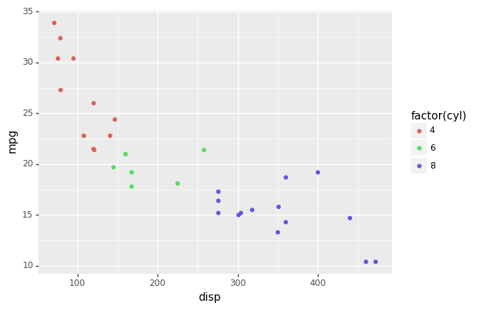
Here we can see we have plotted mpg against displacement of the cars using the ggplot inside the plotnine. Let’s move to the deep side of ggplot.
Factorization of datapoints
In the dataset, we have seen that we have many categorical values like we can categorize our data based on the number of cylinders used by the engine. The above plot can also be factored using colours according to the number of cylinders in the following way.
plot = (ggplot(mtcars, aes('disp', 'mpg'))
 + geom_point())

plot
Output:
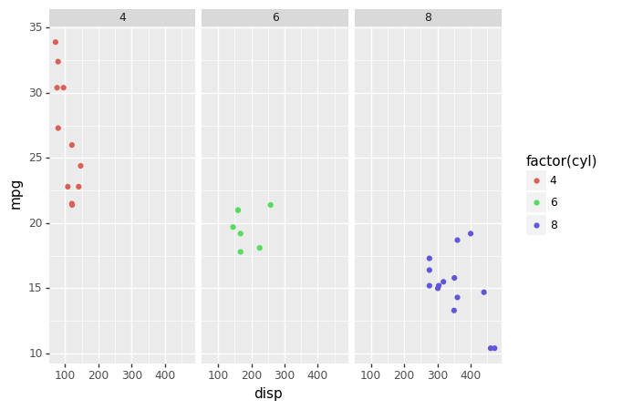
We can also factor graphs instead of just factorization using points using the following lines of code.
plot =(ggplot(mtcars, aes('disp', 'mpg', color='factor(cyl)'))
 + geom_point()
 + facet_wrap('~cyl'))
plot
output:
Let’s make it more stylish.
plot =(ggplot(mtcars, aes('disp', 'mpg', color='factor(cyl)'))
 + geom_point()
 + facet_wrap('~cyl')
 + theme_xkcd())

plot
Output:
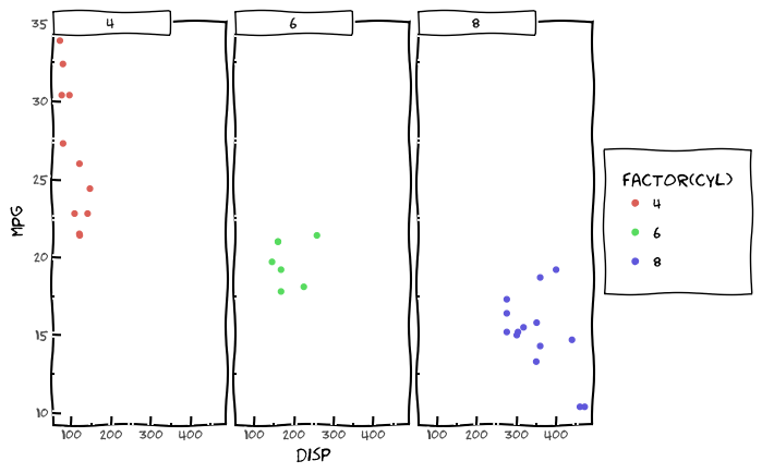
Here we have used the theme of ggplot to make the visualization of data more attractive.
Ggplot with pandas data frame
In this section we will work with pandas data frame for making plots using ggplot, for this, we are using the titanic dataset that can be found here. Let’s import the dataset.
import pandas as pd
data = pd.read_csv('https://web.stanford.edu/class/archive/cs/cs109/cs109.1166/stuff/'+'titanic.csv')
data.head()
Output:

Let’s draw a plot that can tell us how many people from titanic data survived according to their passenger class.
data['Survived'] = data['Survived'].astype('category')
ggplot(aes(x="Pclass", fill="Survived"), data) + geom_bar(stat = 'count') + theme_xkcd()
Output:
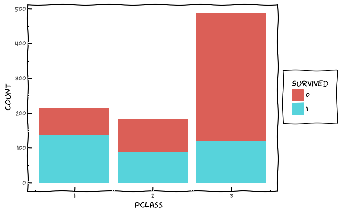
Here we can see a bar chart we made using ggplot for titanic data. Let’s make a plot that can tell us the average age of people who survived and did not survive.
ggplot(data, aes(x='Survived', y='Age')) + \
    geom_violin()
Output:
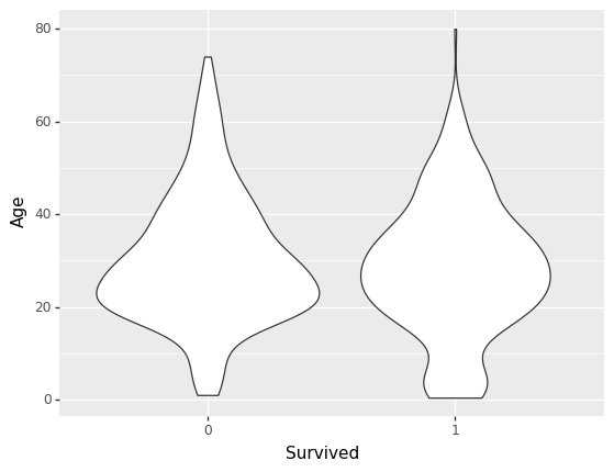
Here we can see that in data we have people who survived are mostly of age 20. Let’s take a look at the graph categorization based on sex.
ggplot(data, aes(x='Survived', y='Age')) + \
    geom_boxplot() + \
    facet_wrap(['Sex'])
Output:
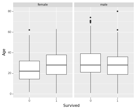
Here we have segregated the people based on their sex and survival status using a box plot that also represents a range according to age. Let’s segregate the plot more.
ggplot(data, aes(x='Survived', y='Age')) + \
    geom_boxplot() + \
    facet_wrap(['Sex','Pclass']) + theme_xkcd()
Output:
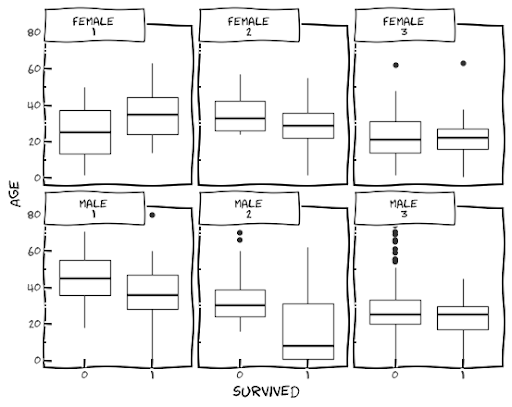
Here we can see a segregated box plot according to sex and class.
Final words
In the article, we have seen how we can use the data visualization features of ggplot in python. For this purpose, we have used plotnine as our base package for ggplot. Using ggplot we have made our visualization procedure more attractive and easy.
References


