Understanding the distribution of data is very important in data analytics and it can be done easily using different types of visualizations. Also, sometimes, we need to make density plots stacked and partially overlapped for better understanding. JoyPY is a python package that helps us in plotting such visualizations through Joyplot. A Joyplot is a series of histograms, density plots or time series for a number of data segments, all aligned to the same horizontal scale. In this article, we are going to discuss how we can make Joyplots using the JoyPy package. The major points to be discussed in the article are listed below.
Table of contents
- About JoyPY
- What are Joyplots?
- Joyplots using JoyPy
Let’s begin with having a quick introduction to JoyPy.
About JoyPy?
JoyPy is a low code python package that can help us in visualization based on ridgeline plots. It is mainly designed using Matplotlib and Pandas. To draw the ridgeline plots which they say joyplots, this package takes codes from Pandas kdes plots. This library can be compared to R package ggridges that is also named as ggjoy in its older version.
What are joyplots?
In simple words, joyplots are density plots but stacking and overlapping make them different from density plots. We mainly use this kind of plot for cross-check distribution of the data. Density plots are very helpful for measuring the changes in the data across one dimension. Stacking and partially overlapping make them more helpful to understand the distribution of the data. We can also call these plots ridgeline plots.

The above visualization can be considered as an example of joyplots. Let’s see how we can start with joyplots using JoyPy.
Joyplots using JoyPy
In the implementation, we will start with very basic joyplots using the iris dataset from scikit learn. Before plotting data we need to install joyPy that can be performed using the following lines of codes.
!pip install joypy
Output:

Now we are ready to draw joyplots using python language. Let’s call the important libraries
import joypy
import pandas as pd
import numpy as np
from matplotlib import pyplot as plt
from matplotlib import cm
from sklearn.datasets import load_iris
Let’s call the sklearn provided iris data.
iris, y = load_iris(as_frame=True, return_X_y=True)
iris.columns = ["SepalLength","SepalWidth","PetalLength","PetalWidth"]
iris["Name"] = y.replace([0,1,2], ['setosa', 'versicolor', 'virginica'])
iris
Output:

In the above, we can see our dataset. Let’s check the density of our data using JoyPy.
%matplotlib inline
fig, axes = joypy.joyplot(iris)
Output:

Here we can see an example of a joyplot or we can also call it a ridgeline plot of iris data.
We also know that with the data we have a group of names we can also plot a joyplot using the different groups. For doing this we are just required to pass the name of the variable that has group information in the data.
fig, axes = joypy.joyplot(iris, by="Name")
Output:

Let’s say in any dataset we have the size of the y-axis in a larger size than just by just defining limits we can compress it like following:
fig, axes = joypy.joyplot(iris, by="Name", ylim='own')
Output:

In above visualization, we can see that the subplot is not comparable directly because of overlapping we can adjust it by using the overlap factor.
fig, axes = joypy.joyplot(iris, by="Name", overlap=3)
Output:

We can also check the distribution of the data using the histogram.
fig, axes = joypy.joyplot(iris, by="Name", column="SepalWidth",
                          hist=True, overlap=0)
Output:

Here we got to know about how we can use JoyPy for generating joyplots of the data efficiently. Of course, we can perform more things in our joyplots. Let’s use some other datasets, for example, we are using the global temperature as our dataset which can be found here.
Let’s import and see the details of our dataset.
df = pd.read_csv('https://raw.githubusercontent.com/leotac/joypy/master/data/daily_temp.csv',comment="%")
df
Output:
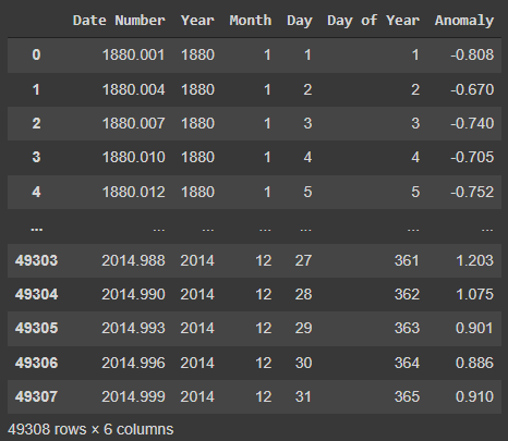
In the data, we can see the anomaly columns that represent the difference between daily values. Using this data we are going to draw a joyplot by grouping the years.
labels=[y if y%10==0 else None for y in list(df.Year.unique())]
fig, axes = joypy.joyplot(df, by="Year", column="Anomaly", labels=labels, range_style='own',
                          linewidth=1, legend=True, figsize=(6,5),
                          title="Global daily temperature 1880-2014",
                          colormap=cm.autumn_r)
Output:

Here in the plot, we can see how the daily temperature distribution of our data shifted across time. We can also make it more use grid function to map the plot better.
fig, axes = joypy.joyplot(df, by="Year", column="Anomaly", labels=labels, range_style='own',
                          grid="y", linewidth=0, legend=True, figsize=(6,5), fade=True,
                          title="Global daily temperature 1880-2014",
                          colormap=cm.autumn_r)
Output:
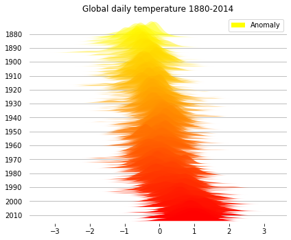
Here we have also provided zero value to the linewidth function. We can also make it faded for a better understanding of the data.

Here we have a much clearer view of the temperature distribution. We can also change the background and color of the lines.
fig, axes = joypy.joyplot(df,by="Year", column="Anomaly", ylabels=False, xlabels=False,
                          grid=False, fill=False, background='k', linecolor="g", linewidth=1,
                          legend=False, overlap=0.5, figsize=(6,5),kind="counts", bins=80)
Output:

Now the distribution of the data has been differently plotted than the other plots. Maybe things are not clear but I performed it just to let us know how using a single command we can perform changes in the visualization using the JeoPy package.
Final words
In this article, we have gone through the usage of the JoyPy package that is similar to the ggjoy package in R. We have performed some of the visualizations and seen how we can change them according to different situations and measurements to make joyplots.
References


