

Everyone in this industry understands the importance of data visualisation and the fact that it is a powerful skill which can be used to tell interesting stories from data. In our previous articles, we have also talked about some of the popular visualisation libraries in Python such as Seaborn and Pandas inbuilt visualisation. In this tutorial, we will introduce you to Plotly and Cufflinks which are popular for their interactive and beautiful plots.
Plotly & Cufflinks
Plotly is an open-source and browser-based graphing library which facilitates interactive plotting. The library is available for a number of programming languages such as Python, R, MATLAB, Perl, Julia, Arduino, and REST, among others.
Cufflinks is another library that connects the Pandas data frame with Plotly enabling users to create visualizations directly from Pandas. The library binds the power of Plotly with the flexibility of Pandas for easy plotting.
Visualising Data With Plotly & Cufflinks
Installing Plotly and Cufflinks
To install Plotly and cufflinks type and execute the following commands
pip install plotly
pip install cufflinks
Note:
If you are using the Anaconda distribution make sure to activate your conda environment using the conda activate command before executing the above commands. Use conda deactivate to exit the conda environment.
Hands-On Visualisation
For those who have followed the Pandas plotting, this may sound fairly simple as all we need to do is import some libraries and rename the plot function of Pandas as iplot which stands for interactive plot. Let’s look at some examples.
Importing necessary libraries
For iplots, you might want to stick to using Jupyter Notebook as it has great support for it.
import plotly
import cufflinks as cf
import pandas as pd
import numpy as np
#Enabling the offline mode for interactive plotting locally
from plotly.offline import download_plotlyjs,init_notebook_mode,plot,iplot
init_notebook_mode(connected=True)
cf.go_offline()
#To display the plots
%matplotlib inline
Importing The Dataset
Consider a simple dataset of random numbers. You can either create your own download the same sample used in the below examples by clicking here.
data = pd.read_csv("sample_data.csv")
This is what the dataset looks like :

Creating Interactive Plots
Let’s do a simple plot of the numerical features in the dataset which are columns A, B and C.
data[['A','B','C']].iplot()

As you can see in the above image, Plotly provides a set of options to play around with the visualisation. On the top right corner of the generated plot, you can see 10 buttons that offer different functionalities. In the order of buttons from going left to right we have one to download the plot as a png image, toggle buttons to switch between zoom mode and pan mode, a zoom in and zoom out button, an autoscale button to reset the scale in the plot, a reset axis button, a button to toggle the spike lines in the graph, and pair of toggle button to switch between different mouse hover modes.
On the bottom right corner of the image, we also get an option to export the graph to Plotly’s online gallery.
Like the Pandas plot function, iplot enables users to use the ‘kind’ keyword argument to plot different kinds of plots such as scatter plots, bar plots, histograms etc. Let’s look at some examples.
Scatter plot :
data[['A','B','C']].iplot(kind = 'scatter' , mode = 'markers')
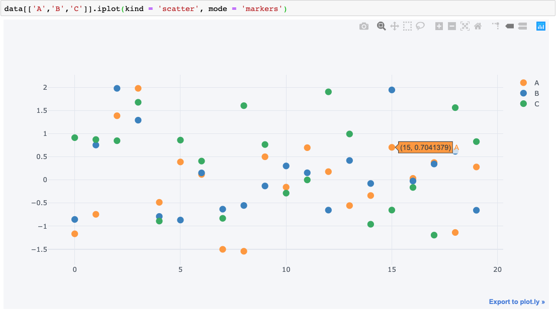
- kind = “scatter” specifies that we need a scatter plot.
- mode = “markers” sets the markers(Otherwise the plot will use lines by default).
You can also pass in the axis variables x and y as arguments, for example, x = ‘A’ sets column A along the X axis.
There is a wide range of arguments that can be passed to the iplot method to customise the visualisations. To understand the full list of arguments click here to head to the official documentation of Pyplot for Python,
Bar Graph:
data.iplot(kind = 'bar', x = 'D', y = 'C')

Surface Plots:
Plotly also allows users to plot 3D interactive plots.
data[['A','B','C']].iplot(kind = 'surface', colorscale = 'blues')

The above code displays the numerical features in the dataset along x,y and z-axis in a 3 Dimensional plane.
Outlook
That was a mere gentle introduction to Pyplot and its capabilities don’t stop here. With almost all sorts of customisations available for each kind of plot, there is no limit for creativity with Pyplot. Pyplot can interactively plot all kinds of charts that are available with Pandas plus many more beautiful visualisations.