

In data visualization, dashboards are the Graphical User Interfaces which display data in an informative and highly interactive way. It contains various plots such as bars, pies, line charts etc. that are actually the visualizations of a dataset by which we can derive some useful information. Dashboards are useful because they are easy to understand and provide us with a clear picture of the key performance indicators.
Streamlit is an open-source python library that allows us to build beautiful, highly interactive, and informative dashboards easily. It also allows us to create custom based Machine Learning and Data Science applications. Every time we save the code streamlit runs from top to bottom and displays the changes in seconds because it is incredibly quick. The UI of streamlit is visually appealing and already loaded so that we don’t have to write the code about the UI of the app.
Throughout this article, we will cover the following points:-
- Installing streamlit
- Building streamlit dashboard applications
- Visualizing insights through streamlit dashboard
In order to use streamlit, we need to install it using pip install streamlit
Before building our Streamlit Dashboard let us analyze the sample applications that are pre-loaded in streamlit. For this, we need to open the anaconda command prompt and run streamlit using the command given below.
streamlit hello
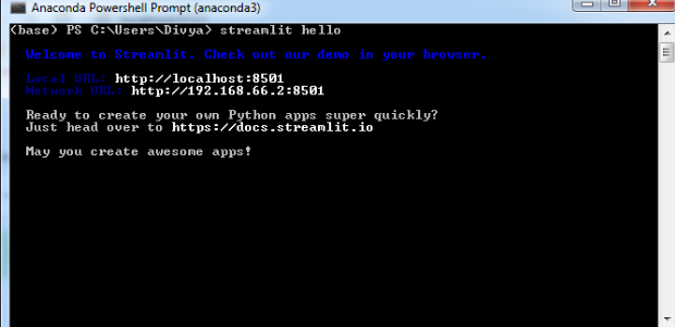
This will run streamlit at the local URL mentioned.

You can select any demo you want to explore and go through different documentation that is provided there on the homepage. Now, let us build our own dashboard of Covid-19 in India.
For creating the script for streamlit you need to have a code editor installed, I personally prefer “Atom” but you can use any code editor. The dataset I am using here can be downloaded from the online repository.
Implementation
a. Importing Libraries
We will start by importing some important libraries which we will be using. We need libraries to load our data and to visualize the data.
import streamlit as st
import pandas as pd
import numpy as np
import plotly.express as px
from plotly.subplots import make_subplots
import plotly.graph_objects as go
import matplotlib.pyplot as plt
b. Importing the dataset
df = pd.read_csv(“C:/Users/covid_dataset.csv’’)
c. Building the dashboard application
In this dashboard, we will visualize the cases of Covid-19 in India through different visualization charts.
Streamlit has predefined functions which are very helpful in creating dashboards and displaying the data beautifully.
- st.title() and st.markdown() are used for headings and markdowns respectively.
- st.sidebar() is used for displaying data on the sidebar.
- st.dataframe() to display the data frame
- st.map() to display the map in just a single line code etc.
There are many more functions in streamlit and we will try and cover maximum while creating our dashboard.
Starting with setting the title and the sidebar title for streamlit dashboard
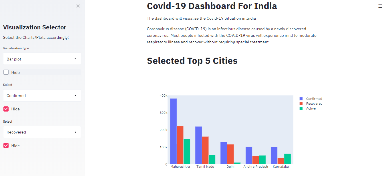
st.title("Covid-19 Dashboard For India")
st.markdown('The dashboard will visualize the Covid-19 Situation in India')
st.markdown('Coronavirus disease (COVID-19) is an infectious disease caused by a newly discovered coronavirus. Most people infected with the COVID-19 virus will experience mild to moderate respiratory illness and recover without requiring special treatment.')
st.sidebar.title("Visualization Selector")
st.sidebar.markdown("Select the Charts/Plots accordingly:")
A. Visualization (part-1: Cases using bar chart and pie chart)
In this part, we will create a widget that will display the data in a bar plot and pie chart form. While creating widgets in streamlit we should keep in my about allotting a unique key for similar types of widgets others streamlit won’t be able to differentiate between the widgets.
The code below will create our first part of the visualization.
select = st.sidebar.selectbox('Visualization type', ['Bar plot', 'Pie chart'], key='1')
if not st.sidebar.checkbox("Hide", True, key='1'):
if select == 'Pie chart':
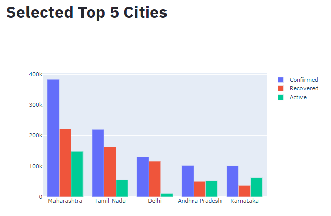
st.title("Selected top 5 cities")
fig = px.pie(df, values=df['Confirmed'][:5], names=df['State'][:5], title='Total Confirmed Cases')
st.plotly_chart(fig)
if select=='Bar plot':
st.title("Selected Top 5 Cities")
fig = go.Figure(data=[
go.Bar(name='Confirmed', x=df['State'][:5], y=df['Confirmed'][:5]),
go.Bar(name='Recovered', x=df['State'][:5], y=df['Recovered'][:5]),
go.Bar(name='Active', x=df['State'][:5], y=df['Active'][:5])])
st.plotly_chart(fig)

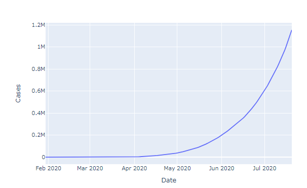
B. Visualization (part 2: active and confirmed cases on time series)
For this, we need another dataset which contains the date wise cases registered in India so that we can create a line plot to visualize the trend of Covid-19.
The code below will provide us with a new widget which will show us the time-series visualization.
 df2 = pd.read_csv('C:/Users/Divya/timeco.csv')
df2['Date'] =  df2['Date'].astype('datetime64[ns]')
select1 = st.sidebar.selectbox('Select', ['Confirmed', 'Recovered'], key='2')
if not st.sidebar.checkbox("Hide", True, key='3'):
    if select1 == 'Confirmed':
        fig = px.line(df2, x="Date", y="Cases")
        st.plotly_chart(fig)
    elif select1 == 'Recovered':
        fig = px.line(df2, x="Date", y="Recovered")
        st.plotly_chart(fig)

C. Visualization (part-3: Area Charts)
In the third part, we tried creating a visualization known as area chart which will allow us to visualize the COVID spread according to area charts.
Don’t forget to set the unique key for the widgets.
select2 = st.sidebar.selectbox('Select', ['Confirmed', 'Recovered'], key='3')
if not st.sidebar.checkbox("Hide", True, key='4'):
          if select2 == 'Confirmed':
         fig = px.area(df2, x="Date", y="Cases")
         st.plotly_chart(fig)
          elif select1 == 'Recovered':
                fig = px.area(df2, x="Date", y="Recovered")
                    st.plotly_chart(fig)

Similarly, we can create as many sections as we want and visualize different aspects of a dataset using streamlit.
While making dashboards using streamlit you will realize that displays the changes as soon as you save them which helps in visualizing them simultaneously and saves a lot of time. This dashboard is just an example of what streamlit can do, you can try creating streamlit dashboards with your dataset and make visually appealing charts and graphs.
Now let us have a look at the Dashboard we have created. For running our dashboard we need to run a python script using streamlit. I saved my file named ‘covid.py’. You can choose whatever name you want and launch it by running the below command in the Anaconda command prompt.
streamlit run covid.py

This is how the homepage of our app is looking, we can select different options and visualizations from the sidebar and see how streamlit displays it.
These graphs and plots are created using Plotly that is why they are highly interactive and can be downloaded easily.
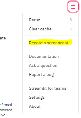
Streamlit also allows us to record a screencast of our app so that we can share what we have created with our friends, colleagues, etc.
Conclusion
Streamlit is considered to be the fastest-growing Machine Learning and Data Science app building platform. It is open-source and the community is updating it frequently with new updates. It is considered to be one of the best dashboarding tools. Now as you have learned how to use streamlit go ahead and keep experimenting with the different datasets and create new apps and dashboards.