In this modern data science scenario, there are many kinds of data required to analyze, and various analysis algorithms help us view the data better or understand the data. Still, when it comes to analysis, a series evolving with time, the spectrogram is the most common tool we frequently use to analyze this kind of data. Audio files, sound waves, and magnetic waves are the most common examples of this kind of data; all of them provide signal information in the form of data. Therefore, measuring the frequency and amplitude of the signals can be considered the main motive of the spectrogram.
For visualising signals into an image, we use a spectrogram that plots the time in the x-axis and frequency in the y-axis and, for more detailed information, amplitude in the z-axis. Also, it can be on different colors where the density of colors can be considered the signal’s strength. Finally, it gives you an overview of the signal where it explains how the strength of the signal is distributed in different frequencies.
So the amplitude and the frequency of the signal are the two main components of any spectrogram. Next in the article, we will have a general definition of both of them so that we won’t get confused about the terms we will use later in the article.
Frequency
Mathematically, frequency is the number of waves passing through a fixed point in a single time unit or the number of cycles performed by a body in a single time when it is in a periodic motion.
Amplitude
Amplitude can be defined as the greatest distance travelled by a moving body in a periodic motion in a single time unit or the highest distance of the wave on dips down or rising from its flat surface.
The image below can give us the visualization of these components.
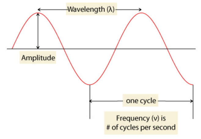
Image source
Let’s move on the spectrogram side.
The mathematics behind the spectrogram is based on the Gabor transform. We use the Gabor transform to compute the spectrogram. Gabor transform is the special case of the short-time Fourier transform used to extract the sinusoidal frequency and phase content of a signal in its particular section. In Fourier transform, we take some signals in space or time and write them into their frequency components. More formally, from any signal, after performing a Fourier transform, we can pull out the signal’s frequency components that help to make the signal. In the images below, we can see the graphs of signal and frequency after the Fourier transform of the signal.
Hereafter the Fourier transform, we can see the frequency components but for example, let’s consider the signal in the image as an audio signal of any song. Then we can know by the time domain graph what the words or tune is playing. By the frequency domain graph, we will be able to know what is the frequency of the tune. If we don’t know about the frequency at a particular time, Gabor transform comes into the picture to resolve this.
Gabor Transform
Gabor transform allows us to figure the spectrogram of any signal by using the time-frequency plot to easily track details in a signal like the frequency with the time factor. In Gabor transform, we multiply the Gaussian function to our signal function. The function can be regarded as the window function, and the resultant of the process is then transformed with the Fourier transform to derive the time-frequency analysis.
The window function is the signal near the time we want to analyze the signal and provide it with a heavier weight. Mathematically we can represent the Gabor transform as:

Image source.
In the image, we can see that the Gabor transform is built on the Fourier transform. As discussed before, we can see that to get the Gabor transform, we are multiplying the Fourier transform of the function with the window function of the frequency. The window function will slide with time, so basically, the window function is a function of the time range, or at a time, we can say that time to complete one frequency of the signal.
In the image below, we can imagine that we have taken a gaussian window that slides across the signal. When it is positioned in a particular time domain, it will provide the weight to the signal of that particular time. Thus, it will generate the key present in our time-frequency graph of the signal in the form of small dashes. The distance from the x-axis is showing the magnitude of frequency where the distance from the y axis is showing the time.
Next, we will see how we can make the spectrogram using python and also, we will be looking at the insights from the graph of any signal. There are various ways to make any spectrogram in python, and various libraries provide the direct modules to make spectrograms of any signal. So, let’s see how we can do that.
Implementation of Spectrogram in Python
Importing the required libraries :
Input:
import numpy as np
from scipy import signal
from scipy.fft import fftshift
from matplotlib import mlab
mport matplotlib.pyplot as plt
mport matplotlib.pyplot as plt
Making a signal using scipy in python:
Input:
fs = 10e3
N = 1e5
NFFT = 1024
amp = 2 * np.sqrt(2)
noise_power = 0.01 * fs / 2
time = np.arange(N) / float(fs)
mod = 500*np.cos(2*np.pi*0.25*time)
carrier = amp * np.sin(2*np.pi*3e3*time + mod)
noise = rng.normal(scale=np.sqrt(noise_power), size=time.shape)
noise *= np.exp(-time/5)
x = carrier + noise
Here I have created a signal which is a 2 Vrms sine wave with modulated frequencies around 3000 Hz, and also the amplitude of the signal is slowly decreasing from 20000 Hz to 100000 Hz.
Next, we can make a plot of the signal so that we can have its overview.
Input:
plt.figure(figsize=(10,12))
plt.plot(x)
plt.show()
Output:

Here we can see the waves of the images, which tells how the signal’s amplitude is changing.
Let’s make a spectrogram of the signal using scipy.signal.spectrogram.
Input:
f, t, Sxx = signal.spectrogram(x, fs)
plt.figure(figsize=(8,10))
plt.pcolormesh(t, f, Sxx, shading='gouraud')
plt.ylabel('Frequency [Hz]')
plt.xlabel('Time [sec]')
plt.show()
Output:

Here we can see in the spectrogram how our wave is moving on its space, but in scipy’s spectrogram, we do not accurately measure amplitude.
As discussed earlier in this topic, it will be much better to analyze the signal in a spectrogram when we can have all components (frequency, amplitude) with time in one image. So I basically prefer to use matplotlib to make a spectrogram of any kind of signal.
Using matplotlib to make the spectrogram.
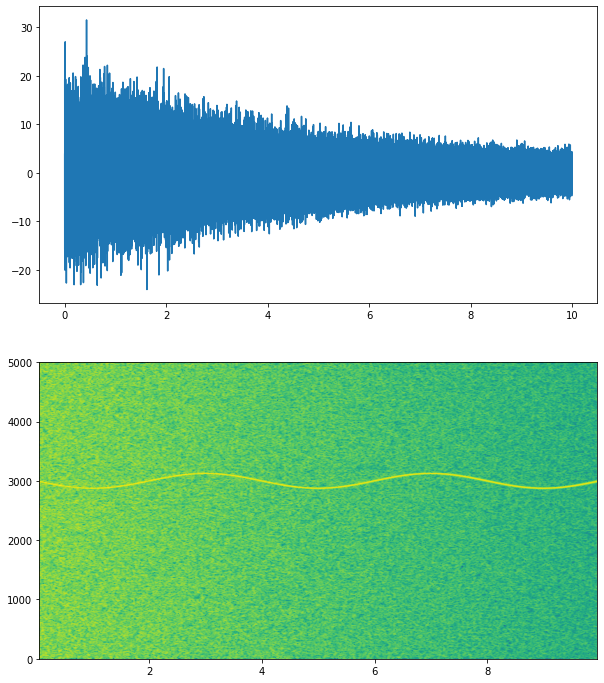
Input:
fig, (ax1, ax2) = plt.subplots(nrows=2)
ax1.plot(time, x)
Pxx, freqs, bins, im = ax2.specgram(x, NFFT=NFFT,Fs=fs, noverlap=900)
plt.show()
Output:
.
In this graph, we can see that as the amplitude decreases, the color of the spectrogram is varying or getting darker than before. So if we are working with any fluctuating audio file and by this graph, we can understand how the frequency(curve line of yellow color) is changing with time and what is the amplitude component of the particular time.
We can modify that graph more in the next input. I am providing it with a color label to see the exact value of magnitude at a particular time.
Input:
def specgram2d(y, srate=44100, ax=None, title=None):
  if not ax:
    ax = plt.axes()
    ax.set_title(title, loc='center', wrap=True)
    spec, freqs, t, im = ax.specgram(y, Fs=fs, scale='dB', vmax=0)
    ax.set_xlabel('time (s)')
    ax.set_ylabel('frequencies (Hz)')
    cbar = plt.colorbar(im, ax=ax)
    cbar.set_label('Amplitude (dB)')
    cbar.minorticks_on()
    return spec, freqs, t, im
fig1, ax1 = plt.subplots()
specgram2d(x, srate=fs, ax=ax1)
plt.show()
Output:

Here we can see more on the graph. Now we can easily measure the amplitude component of the signal with time using the color label. We can also visualize the signal in 3D to understand how the signal is going in the 3-dimensional space.
Input:
def specgram3d(y, srate=44100, ax=None, title=None):
 if not ax:
  ax = plt.axes(projection='3d')
  ax.set_title(title, loc='center', wrap=True)
  spec, freqs, t = mlab.specgram(y, Fs=srate)
  X, Y, Z = t[None, :], freqs[:, None],  20.0 * np.log10(spec)
  ax.plot_surface(X, Y, Z, cmap='viridis')
  ax.set_ylabel('frequencies (Hz)')
  ax.set_ylabel('frequencies (Hz)')
  ax.set_zlabel('amplitude (dB)')
  ax.set_zlim(-140, 0)
  return X, Y, Z
fig2, ax2 = plt.subplots(subplot_kw={'projection': '3d'})
specgram3d(x, srate=fs, ax=ax2)
plt.show()
Output:

Here we can see all three dimensions in one picture. Here it is a little messed up, but it can be helpful when working with real data.
There are more ways to make the spectrogram of the signal. We can also use TensorFlow to make a spectrogram. I have written an article to explain the whole TensorFlow to preprocess the audio data with a spectrogram. Please refer to the article here- link. There are various uses of the spectrogram, like classification of the music, sound detection, where we compare the spectrogram of saved audio files to the target audio file. The ocean also sometimes uses the spectrogram for object detection by sending the SONAR waves and collecting the variation in waves in the form of spectrograms.
Here in the article, we have seen what a spectrogram is, the mathematics behind the spectrogram, and how can we visualize spectrograms using python libraries. We have also gone through some examples that are done by the use of spectrograms.
References
.


