Plotly is now more powerful than ever with a new open source library named JupyterDash. JupyterDash is developed on top of the Dash framework to make it completely suitable for notebook environments such as Colab. The open source JupyterDash library makes the plots real-time interactive in Colab with hovers, handles, and other good controls. Changes in data or code causes immediate effect in visualizations, making Plotly a handy solution to streaming data. Furthermore, it makes Colab visualizations be displayed on a separate web page with hot reloading and input/output interactions.
Visualizations talk better than words! Let’s start exploring some cool and beautiful plots made using Plotly along with JupyterDash.
Set up the environment in Colab
Requirements: Python 3.6 or above, Plotly 4.4.0 or above
It is recommended that Plotly be upgraded to its latest version using following command
!pip install --upgrade plotly
JupyterDash can be installed in Colab using the following command
!pip install jupyter-dash
Plotly offers most of its attractive plotting methods with two major interfaces namely, express and graph-objects. JupyterDash works with dependency modules such as dash_core_components, dash_html_components, and dependencies class from dash library.
Let us begin plotting by importing the frameworks and libraries.
 import plotly.graph_objects as go
 import plotly.express as px
 from jupyter_dash import JupyterDash
 import dash_core_components as dcc
 import dash_html_components as html
 from dash.dependencies import Input, Output
Sunburst Plot
Sunburst plots in Plotly is one among the famous and interactive plots. It follows a path to burst out data in the form that looks like the solar system. It helps in identifying categories of data based on one or more features. With the famous in-built gapminder dataset, we can have a sunburst plot using the code below:
 # load data from builtin Plotly data
 df = px.data.gapminder()
 # prepare a sunburst figure
 fig = px.sunburst(df, path=['continent', 'country', 'year'], values='pop',
                   color='lifeExp', hover_data=['iso_alpha'],
                   color_continuous_scale='twilight',
                   color_continuous_midpoint=np.average(df['lifeExp'], weights=df['pop']))
 # build jupyter dash app
 app = JupyterDash(__name__)
 # add html components and figure to app
 app.layout = html.Div([dcc.Graph(figure=fig)])
 # run app inline
 app.run_server(mode='inline')
We can notice that the mode provided in run_server command is ‘inline’. Leaving it to default will let us open the JupyterDash visualization in a browser. If the notebook is prepared in JupyterLab, mode can be set to ‘jupyterlab’, which will open the visualization in a new tab of JupyterLab.
We can look at how the plot can be read or well utilized by hovering over the plot or tapping any region of the plot. If we tap on the continent region ‘Europe’, the plot will burst out of that particular ‘Europe’ family by hiding all other regions and their families. As said, we can further explore a particular country to learn how population or life_expectancy has changed over years.
The two plots are first-level and second-level burst-out explorations of ‘Europe’ and ‘Turkey’ respectively.
To know all the necessary details of a particular block in the plot, we can hover the mouse pointer over it.
Bubble Chart
Bubble charts of Plotly are the simple scatter plots. They are so popular than scatter plot versions of Matplotlib library or Seaborn library in such a way that they can be plotted quickly, differentiate features easily with colors and size without hassle. On top of all, these plots are more interactive. We can understand its interactivity through an example. The following codes develop a JupyterDash visualization with ‘GDP per capita’ in x-axis and ‘Population expectancy’ in y-axis. Size of bubbles are determined by ‘Population’ and the color of bubbles are determined by ‘Continent’.
 data = df.query('year==2002')
 fig = px.scatter(data, x="gdpPercap", y="lifeExp", size="pop", color='continent', hover_name="country", size_max=60)
 # build jupyter dash app
 app = JupyterDash(__name__)
 # add html components and figure to app
 app.layout = html.Div([dcc.Graph(figure=fig)])
 # run app inline
 app.run_server(mode='inline')
More number of bubbles make the plot difficult to read. This is where Plotly proves its plots are interactive. By clicking or double-clicking on any one or more of legends, here ‘Continent’, we can visualize bubbles belonging to desired ‘Continent’ only. The following plot shows Asian countries alone by hiding all other continents.
Further, as discussed in Sunburst plots, hovering over bubbles yields more details about them.
These bubble charts can be explored as 3D plots with the following codes:
 data = df.query('year==2002')
 fig = px.scatter_3d(data, z="gdpPercap", y="lifeExp", x='continent', color="gdpPercap", size='pop', hover_name="country", size_max=60)
 # build jupyter dash app
 app = JupyterDash(__name__)
 # add html components and figure to app
 app.layout = html.Div([dcc.Graph(figure=fig)])
 # run app inline
 app.run_server(mode='inline')
3D plots can be panned, zoomed, rotated along one or more axes to get better insights of data.
Sankey Diagrams
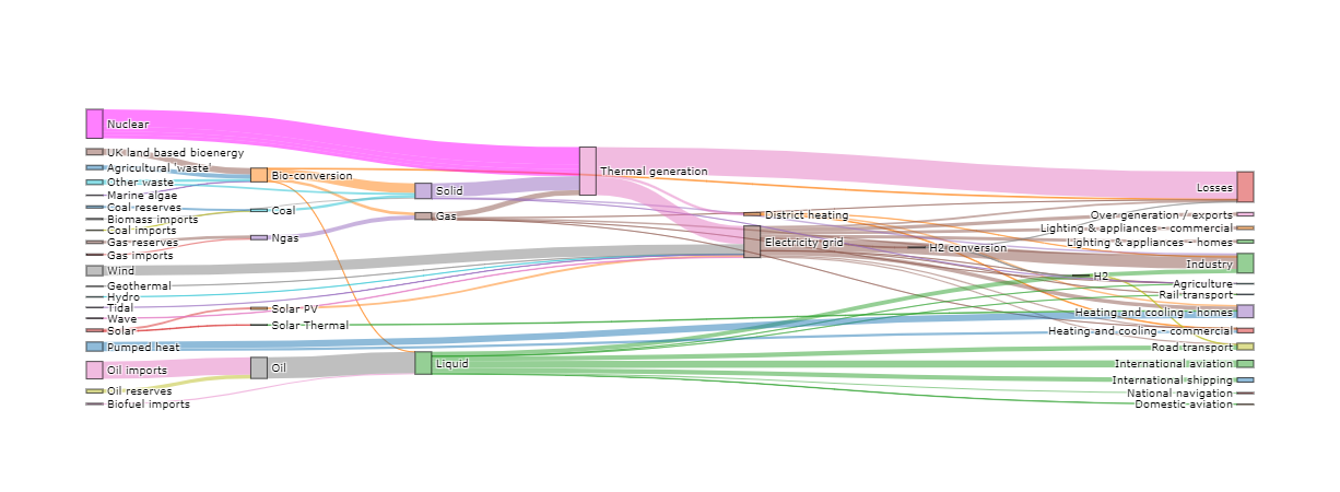
Sankey diagrams are well suited for data which has features interacting at multiple levels. Sankey diagrams essentially have three important parameters: source, target, value. Source and target can be grouped together as nodes. Size of a node is determined by the value it holds. Sources and targets are connected through ribbon-like connectors. These nodes and ribbon-like links can be moved within the diagram to visualize the plot conveniently or to focus on certain details. The following codes generate a JupyterDash based Plotly Sankey diagram. In order to explore one of the greatest features of JupyterDash, receiving real-time inputs through plots, a slider bar is incorporated. It helps adjusting the opacity of chart by sliding the pointer left or right.
 import json
 import urllib
 url = 'https://raw.githubusercontent.com/plotly/plotly.js/master/test/image/mocks/sankey_energy.json'
 response = urllib.request.urlopen(url)
 data = json.loads(response.read())
 app = JupyterDash(__name__)
 app.layout = html.Div([
     dcc.Graph(id="graph"),
     html.P("Opacity"),
     dcc.Slider(id='opacity', min=0, max=1,
                value=0.5, step=0.1)
 ])
 @app.callback(
     Output("graph", "figure"),
     [Input("opacity", "value")])
 def display_sankey(opacity):
     opacity = str(opacity)
     # override gray link colors with 'source' colors
     node = data['data'][0]['node']
     link = data['data'][0]['link']
     # Change opacity
     node['color'] = [
         'rgba(255,0,255,{})'.format(opacity)
         if c == "magenta" else c.replace('0.8', opacity)
         for c in node['color']]
     link['color'] = [
         node['color'][src] for src in link['source']]
     fig = go.Figure(go.Sankey(link=link, node=node))
     fig.update_layout(font_size=10)
     return fig
 # open in Colab itself
 app.run_server( mode='inline')

Plotly has different types of plots with a far numerous options to improve them. JupyterDash makes those plots production-ready by embedding web-browser or app based real-time interactions. This article has attempted to give a kick-start to Plotly and its beauty, chiefly along with JupyterDash library. Readers can explore more interactive plots and better data insights by giving these libraries a try.


