|
Listen to this story
|
Exploratory data analysis is the process of understanding the data thoroughly for key characteristics and understanding each feature’s importance statistically. As the name suggests exploratory data analysis helps in exploring the data statistically and formulating certain hypotheses as required. Generally, exploratory data analysis is considered a tedious task and this is where LUX is paving its way by automating the entire exploratory data analysis in one single step. So in this article let us see how to use LUX python API to perform exploratory data analysis.
Table of Contents
- The need for Automating EDA
- Automating EDA using LUX
- Implementation of LUX python API
- Final words
Before starting with the LUX environment let’s first discuss the need for Automated EDA.
The need for Automating EDA
Exploratory data analysis is a process of analyzing the datasets to summarize the important statistical significance of features and visualize the spread of each feature through appropriate visuals. But visualizing each of the features is a tedious task when there are many features in the dataset as checking the correlation of each of the features would be a lengthy process. So this is where the process of automating EDA plays a vital role in reducing the overall time spent on data analysis and time spent on optimal feature selection and also on outlier analysis.
Are you looking for a complete repository of Python libraries used in data science, check out here.
This is where the need for Automating the exploratory data analysis process occurs and automation of exploratory data analysis is supported by various Python libraries and APIs like LUX, SweetViz, AutoViz, and many more come into play. In this article let us explore how to use the LUX Python API to automate the exploratory data analysis procedure.
Automating EDA using LUX
LUX is a simple python API that helps in quick and easy data exploration by providing easily interpretable plots by just reading the data frame in the LUX-activated working environment. Visualizations are produced in an interactive widget with various feature tabs to slide through and understand the characteristics of the data.
Some of the standard widgets supported under the LUX module are as follows.
- Correlation
- Distribution
- Occurrence
- Geographical
Correlation widget
The correlation widget helps in analyzing the correlation between two numerical features of the data in the form of a scatter plot. All the numerical features will be mapped into sets of two features and the correlation between the two features can be visualized in order to analyze the features with a higher correlation.
Distribution widget
The distribution widget of the LUX python API is responsible for generating histogram visuals for all the numerical features providing the count of each of the features through histogram bins. The distribution widget mainly helps in analyzing the frequency of numerical features
Occurrence widget
The occurrence widget of LUX python API is responsible for generating horizontal bar plots by analyzing the frequency of occurrence of categorical features present in the data. For each of the categorical features and for each class of categorical features frequency occurrence is provided in the form of visuals under the occurrence widget.
Geographical Widget
The geographical widget of LUX API basically shows the choropleth maps for geographical locations in the dataset. The mean of certain numerical features is computed for each region on the maps and by just hovering on the map the mean value for each region can be computed under each of the geographical locations in the data.
Implementation of LUX python API
In this let us see how to use the LUX Python API to automate the exploratory data analysis process. For utilizing the LUX python API we have to first install the LUX API in the working environment.
!pip install lux-api
Now after installing the LUX API in the working environment let us import the API in the working environment along with the pandas module to read the dataset.
import lux
import pandas as pd
In certain working environments, certain widgets for visualizing from APIs have to be permitted by installing the corresponding visualizing widgets. Here let us see how to permit the LUX API to produce visuals in Google Colab.
from google.colab import output
output.enable_custom_widget_manager()
Once the widgets have been set the final step is just to read the dataset using the pandas module in the working environment.
df=pd.read_csv('/content/drive/MyDrive/Colab notebooks/EDA using LUX/WA_Fn-UseC_-HR-Employee-Attrition.csv')
df

This is how by just reading the dataframe in the LUX activated working environment the entire exploratory data analysis process is automated and various widgets are produced.
Correlation widget output interpretation
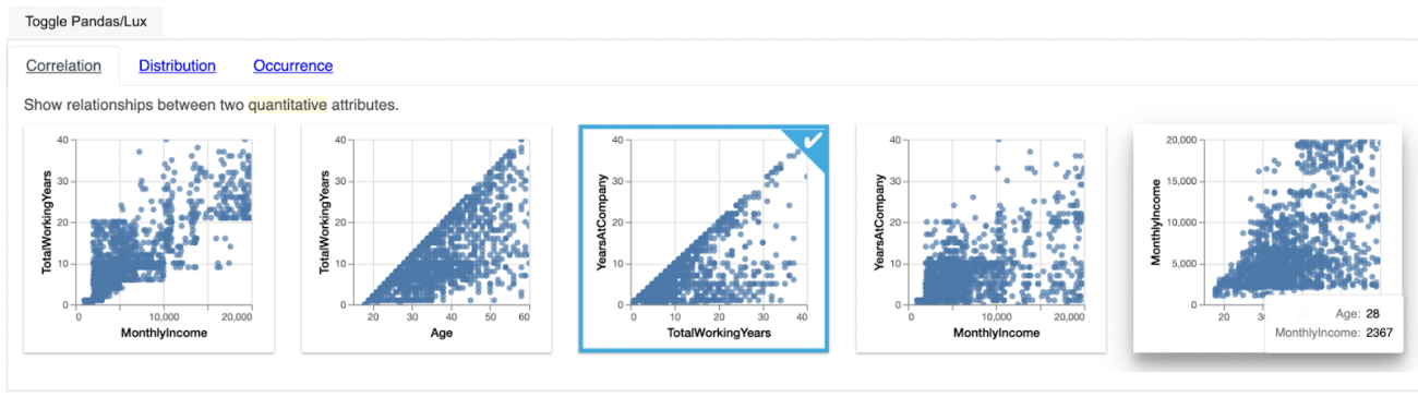
In the above image let us consider the first plot for Monthly Income and Total Working Hours and we can see how these two features are correlated with each other.
Distribution Widget Output Interpretation
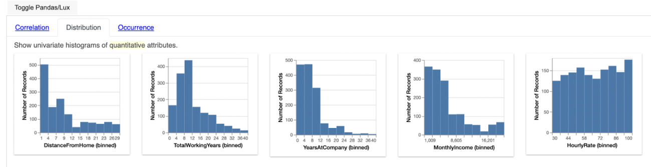
In the above image if we consider the first plot we can easily interpret the frequency occurrence of each of the numerical features present in the dataset.
Occurrence Widget Output Interpretation

In the above image if we consider the first plot we can clearly see that the feature Performance rating is having two categories we can correspondingly also analyze the frequency occurrence of each of the categories.
Custom feature visualization using LUX
Instead of visualizing the entire dataset LUX also has the flexibility to analyze the characteristics of required features as shown below. But for custom features selected there are new three widgets supported under LUX API there are Enhance, Filter and Generalize.
df.intent = ["YearsAtCompany","HourlyRate"]
df
So here two numerical features are selected from the data to understand its various characteristics using the LUX API.
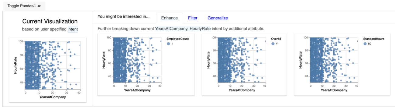
So if required features are selected from the dataset this is the visualization widget generated by the LUX API. Let us try to understand what each widget has to convey.
Enhance widget output interpretation
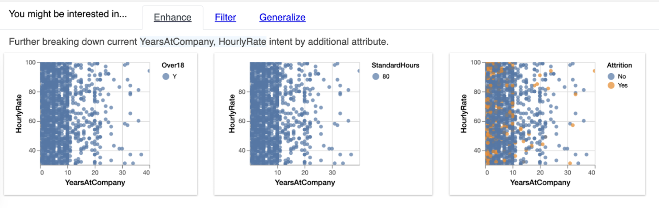
The enhance widget explains how additional features of the dataset affect the relationship of the two custom variables selected. In the above output, we can see how HourlyRate and Years at Company are related to other features of the dataset like StandardHours and Attrition.
Filter widget output interpretation
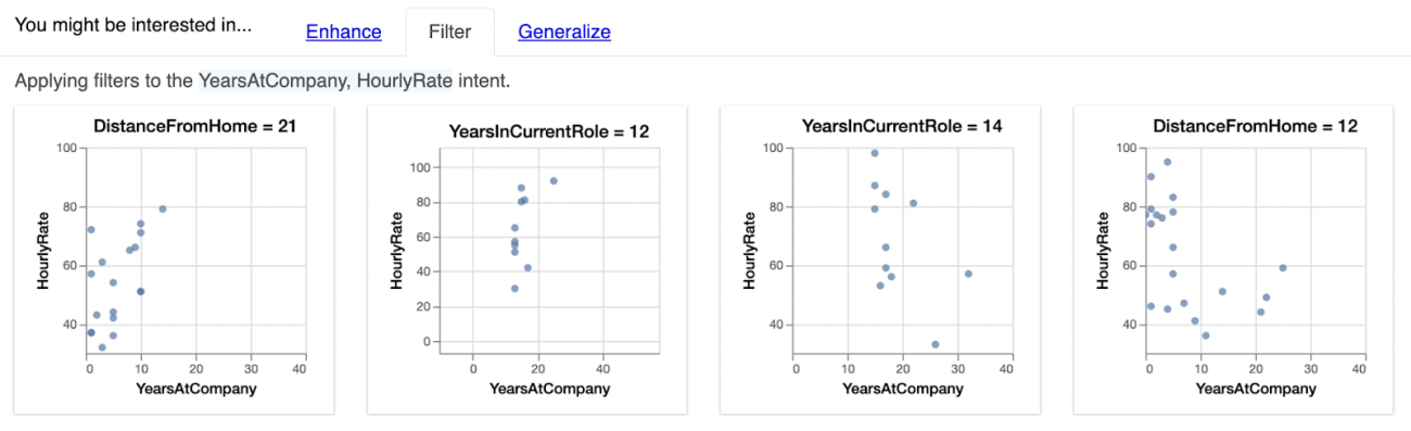
The filter widget considers the two custom features and produces correlation plots for a various subsets of features by analyzing each feature relation with respect to the custom features selected from the dataset.
Generalize widget output interpretation

The generalize widget considers only the custom features selected and removes if there any filter constraints in the features and shows a histogram distribution of the custom features selected for analysis.
Analyzing Geographical data using LUX API
For analyzing geographical data using LUX API a population dataset was used across various states.
df = pd.read_csv("https://github.com/covidvis/covid19-vis/blob/master/data/interventionFootprintByState.csv?raw=True",index_col=0)
df.head()

Later for obtaining the analysis through the LUX API framework the dataframe instance was just called in the working environment.
df
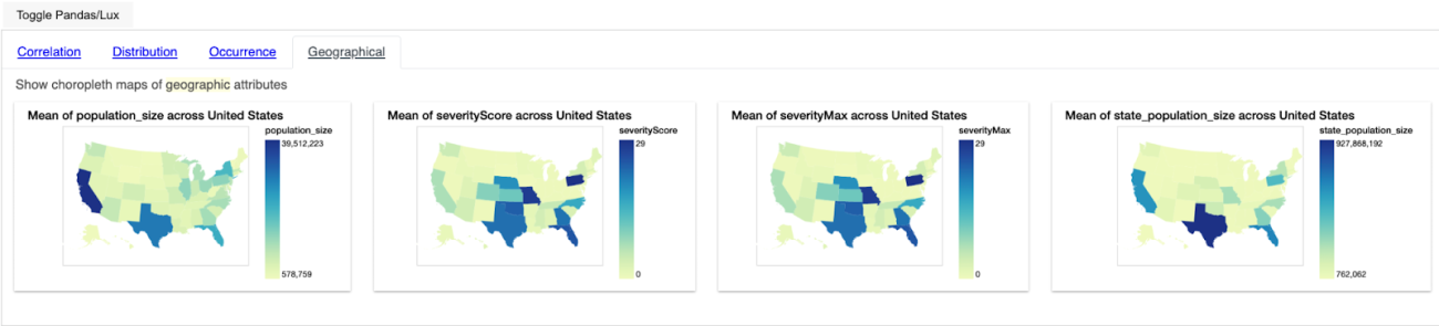
Interpreting the Geographical widget
In the above image, we can see that for various states in the dataset the mean values for various numerical features were computed for various areas in the respective states. Just by hovering over the map, we can interpret the mean of the corresponding numerical feature for the respective areas in each state.
Final words
Automating exploratory data analysis helps in cutting down 60% of the work that goes into data cleaning and analysis. By automating exploratory data analysis, optimal feature selection and checking correlation among features becomes easy and due to this more time can be utilized to produce more generic and reliable models for the respective tasks using the data. Among various automated exploratory data analysis APIs python offers LUX is one such API where the entire analysis of the data is obtained by just reading the data in the LUX activated environment to generate suitable insights from the data.