Laziness causes a large proportion of poor data graphics. Highlighting two variables and clicking the dual axis option takes seconds, but produces a confusing mess for your readers. The second axis (what I call the axis of evil) adds complexity to the graphic by asking the reader to compare two different things, on two different scales, with spatially dislocated axes. Even more problematic, since the axes are independently scaled any implied comparison is meaningless.
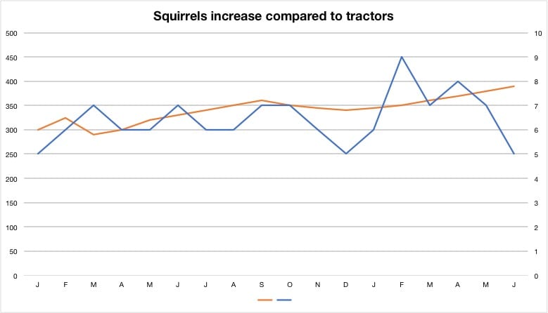
I plot squirrels and tractors* using the axis of evil. The reader must first orient the two variables and identify which variable belongs to which axis, deceptively difficult and easy to forget. Once oriented, the reader will analyze the two variables. But it is a false comparison. Each axis starts at zero then goes to its variable’s maximum observation, so each axis has its own magnitude. Despite mushing them into the same chart, the slopes are random in relation to each other. It’s like stretching a stock chart until it fits the skyline of Mt Everest and then blaming the recession on the Himalayas. In this case, the analysis suggests that squirrels increase steadily against tractors.
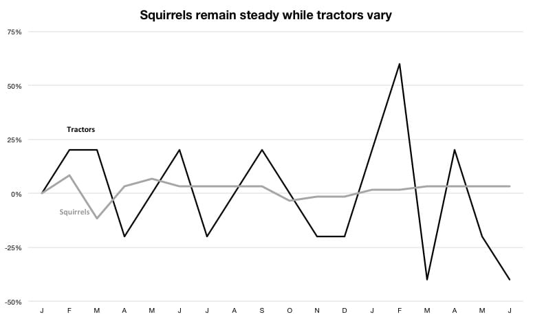
A smarter approach transforms the variables into the same units. In this case I have chosen a cumulative growth rate. This allows me to reduce the complexity of the chart by having a single axis while putting squirrels and tractors on the same scale. I’ve also dumped the legend and made the font larger while keeping the chart the same size. The transformation permits a legitimate and intuitive comparison, suggesting squirrels pretty much remain flat while tractors have high variation.
Clicking the axis of evil button may make your life easier, but it transfers your job as an analyst onto the reader and may lead them to an incorrect conclusion.
- I used to use the “apple versus oranges” argument until scientists proved that apples and oranges are pretty much the same things.