


Data is an entity that is omnipresent in every aspect of life. Whether it be in spreadsheets, your sales pipeline, social media platforms and more, it can be termed a collection of facts, numbers, words, measurements, observations that have been translated into a form that computers and systems can process. Every piece of information collected or recorded is treated as data that is stored and recorded by systems or humans, individually or combined. Data can be used to measure and understand a wide range of internal and external activities in every ecosystem. With the growth of the world wide web and smartphones becoming technologically superior over the past decade, it has led to a surge in digital data creation. Data churned these days now also include text, audio and video information, and web log and web activity records, which can be categorized as unstructured data. The analysis of such data to gain knowledge of what is happening around and to generate insights that might be useful for decision making is known as Data Analysis. The sole purpose of Data Analysis is to extract useful information from data which can become the pivotal factor for decision making based upon the data analysis. It is being said that “data is the new oil”, the more data one has, the more it will aid the analysis, which might aid in discovering groundbreaking facts.
If a business is not growing, one can look back and acknowledge the mistakes and make a plan again without repeating those mistakes. Viceversa, if the business is growing, then one can further plan on making the business grow even more. All you need to do is analyze your business data and business process. Data Analysis includes the following processes: cleaning, analyzing, interpreting, and visualizing. Data analysis tools make it even easier for users to process and manipulate data, analyze the relationships and correlations between the datasets, and it also helps to identify trends for interpretation. Analysis techniques such as Exploratory analysis or In-depth analysis of data become useful tools for data interpretation. Identifying the data you need for analysis can be another challenge with the vast amount of data available. One may choose a data source that isn’t reliable or might miss crucial data sources that should be part of the research being conducted. Reliable and complete data is necessary for accurate data analysis.
Descriptive data analysis tells us the “What happened?” when analyzing the data. Inferential analysis generalizes or hypothesizes about the question of “What happened?” by comparing statistics from groups within an entire population present in the dataset. Other types of analysis, such as Diagnostic analysis, also known as root cause analysis, aim to answer “Why did the following happen?”. Predictive analysis uses data to postulate about future events. It is concerned with “What is likely to happen. The prescriptive analysis is the most advanced form of analysis, as it combines all of your data and analytics, then outputs a model prescription: What action to take.
Using Exploratory Data Analysis, also known as EDA, data scientists can analyze and investigate data sets and summarise their main characteristics, often applying many data visualization methods. One cannot draw reliable conclusions from a massive quantity of data by just glancing over it; data must be taken care of and looked carefully through an analytical perspective. Exploratory Data Analysis helps us determine how to manipulate data sources best to get the answers needed, making it easier for data scientists to discover patterns, spot anomalies, if any, test a hypothesis, or check assumptions. EDA is primarily used to see what the present data can reveal beyond the formal hypothesis testing task. Hence, it provides a better understanding of the variables in the dataset being worked upon and describes theirrelationships. It can also help determine if the statistical techniques one is considering for data analysis are appropriate or not. Exploratory Data Analysis is a highly crucial step before you jump to machine learning or modeling of your data. It provides a clear context needed to develop an appropriate model that helps interpret the results correctly.
Exploratory Data Analysis provides a lot of critical information that is easily neglected at times. Therefore, it helps the analysis in the long run, right from framing questions to displaying results. The term was coined by an American mathematician named John Tukey in the 1970s. EDA techniques continue to be a widely used method in the data discovery process today. When data analysis is done properly, several things seem to fall into place, even from a business perspective within an organization. First, data scientists will always know if they have produced results within the required business context; stakeholders will therefore be assured if they are asking the right questions and even discover interesting trends that even they did not know existed.
Put simply, exploratory data analysis ensures that business executives are getting the results they are looking for and heading in the right direction just by using data analytics. In addition, the EDA can be easily incorporated into BI software and for Dashboarding purposes, which is crucial when a layman wants to know what’s going on in a couple of minutes. Creating a Dashboard also helps get a breakdown of matters through beautiful visualizations and understanding what further decisions need to be taken.
What is SweetViz?
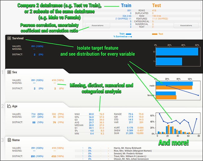
Sweetviz is an open-source Python library that helps generate beautiful, highly detailed visualizations to Exploratory Data Analysis with a single line of code. It also generates a summarised report and can help create interactive dashboards as well. The output generated is a fully self-contained HTML application. The system builds reports around quickly, visualizing the target values and even comparing datasets. SweetViz aims to generate a quick analysis of target characteristics, training vs testing data, and other such data characterization tasks.
Sweetviz comprises of the following features :
- Create Target analysis: How target values boolean or numerical relate to other features
- Visualize and compare different types of datasets: Distinct datasets (e.g. training vs test data) or Intra-set characteristics (e.g. male versus female)
- To Find Mixed-type associations: Sweetviz can discover numerical associations such as Pearson’s correlation, categorical associations like uncertainty coefficient, and categorical-numerical data types seamlessly to help provide maximum information for all data types.
- Type inference: SweetViz automatically detects numerical, categorical and text features, with optional manual overrides
- Discover Summary information such as Type, unique values, missing values, duplicate rows, most frequent values and Numerical analysis: min/max/range, quartiles, mean, mode, standard deviation, sum, median absolute deviation, coefficient of variation, kurtosis, skewness.
Getting Started
In this article, we will try to create an In-Depth Exploratory Data Analysis using SweetViz. We will try to create a dashboard around our data using the SweetViz library and discover some of the features of SweetViz. The following implementation is inspired by a video tutorial, whose link can be found here.
Installing The SweetViz Library
First, we will start by installing the SweetViz Library; for this, you can run the following code,
#installing the library
! pip install sweetviz
Setting up Dependencies
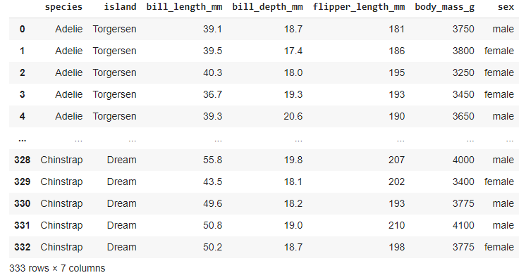
Then we will install the required dependencies and also load our dataset. Here we are using the penguins dataset to analyse, containing all the necessary details for penguins such as their species, island found, body mass, sex and more. We will try to create a Dashboard around the following dataset. You can download the following dataset using the link here.
#importing dependencies
import pandas as pd
#loading the dataset
penguins = pd.read_csv('https://raw.githubusercontent.com/dataprofessor/data/master/penguins_cleaned.csv')
Here we will be trying to discover facts around the species of penguins from our dataset. So we will be splitting the dataset into X and Y, where Y will contain all the information related to the penguin species and X will contain the other information.
# Separating X and y
X = penguins.drop('species', axis=1)
y = penguins['species']
Taking a look at the data present in X,
#displaying data from X
X
Output :
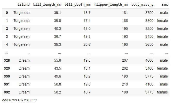
As we can see it comprises both quantitative and qualitative data.
Performing Analysis using Sweetviz
Looking at the entire data later performs EDA on the data split with species to analyze the difference.
#data before split
penguins
Creating a quick and interactive EDA dashboard on the data,
#creating a EDA report
import sweetviz as sv
analyze_report = sv.analyze(penguins)
analyze_report.show_html('analyze.html', open_browser=False)
Displaying Results,
import IPython
IPython.display.HTML('analyze.html')
This will give us the following output,


As we can see that using just two lines of code, SweetViz creates an EDA report in a matter of minutes.
You can also create a correlation matrix graph by clicking the Associations Tab,

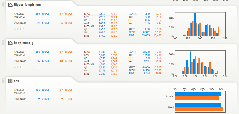
Now Lets Move Ahead and create a comparison report of our Train versus Test Dataset,
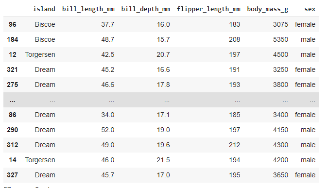
#splitting into train and test
from sklearn.model_selection import train_test_split
X_train, X_test, y_train, y_test = train_test_split(X, y, test_size=0.2)


#displaying Train set
X_train

#displaying Test set
X_test
Creating the comparison report between Train versus Test,
import sweetviz as sv
compare_report = sv.compare([X_train, 'Train'], [X_test, 'Test'])
compare_report.show_html('compare.html', open_browser=False)

#displaying results
import IPython
IPython.display.HTML('compare.html')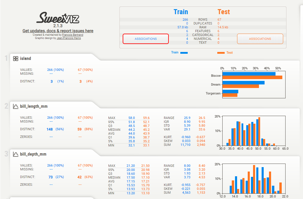
Comparative Association,
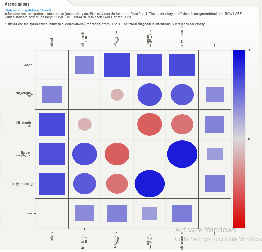
As we can observe, SweetViz holds the capacity to give us a detailed comparison and EDA to help observe and discover insights from our dataset processed.
EndNotes
This article tried to understand the essence of performing Exploratory Data Analysis and answered why it is important. We also got to know how to create an interactive EDA report with just a few lines of code using SweetViz. Finally, I recommend that the reader even further explore the SweetViz library using complex datasets and analyse the insights.
The following implementation can be found as a colab notebook, using the link here.
Happy Learning!