(A) Introduction
The world is in a disastrous situation now. Since the outbreak of coronavirus COVID-19 in Wuhan, China, it took almost no time to affect the entire world. More than 210 countries and territories around the world got affected. More than 1,800,477 COVID-19 cases are identified so far and more than 100,000 deaths have been observed across the globe.
You might have observed that several dashboards are designed to keep the world updated about the COVID-19 spread. Till date, numerous visualizations has been posted in LinkedIn, some of which are beautiful animations that capture the spread of the virus based on the total number of cumulative confirmed cases and deaths. Undoubtedly, you may have found these graphics very intriguing. And, that’s what brought me here.
In this article, I will show you how to create some beautiful animated visualizations using Tableau. While doing so, I will particularly consider the case of the COVID-19 outbreak. This will also enable you to create further visualizations that will reflect the current situation. While there are several ways to visualize this data using animated graphics, we will particularly focus on designing two different graphics to visualize the spread of this virus – (1) using a racing bar plot and (2) using an animated map. This article contains several recorded videos to guide you through the process of creating these visualizations.
(B) Requirement
You will need Tableau 2020.1 (or above) to create the racing bar plot (section D). You may download this version of Tableau from the Tableau website and buy a license for yourself. You may also download this version for free with a 12-day trial period. To create the animated map (section E), the free public version of Tableau is enough.
(C) Data Set
Here is a link to the dataset which we would be using to create the visuals. The dataset contains daily updates on the number of confirmed COVID-19 cases, number of recovered cases and number of deaths due to COVID-19 for each country. You may download this dataset to follow along. Just right-click on the page and save this data as a CSV file in your system.
(D) Racing Bar Plot to Visualize the Spread
Here we go. This is the first animated data visualization exercise I will be taking you through. we will focus on creating a ‘Racing Bar Plot’ to visualize the number of cumulative confirmed COVID-19 cases for all the countries in chronological order. This section is divided into four parts. In the first part, I will demonstrate how to create an animated bar plot using an older version of Tableau.
In the second video, I will demonstrate how to extend this animated graph to a racing bar plot using a newer version of Tableau. In the third video, I will teach you some of the ways to make the graph look beautiful and presentable. Finally, in the fourth and the last video I will show you how to package this visualization in the form of a nice and presentable dashboard and publish it in Tableau Public and get a sharable link of the dashboard.

(D.1) Animated Bar Plot (in Older Version of Tableau)
The first video in this series focuses on creating an animated bar plot using an older version in Tableau (version below 2020.1). This version, however, doesn’t have the necessary feature to create a racing bar chart. We will use the variable ‘Date’ to create the animation, i.e., we would like the graph to update itself with the change in the date. However, the position of the countries in the plot will remain unchanged and will not get sorted according to the number of cumulative confirmed cases. Here is a short summary of what you will learn from this video:
- Connect tableau to a CSV file. (00:22)
- Open a new worksheet. (00:38)
- Create a bar plot. (00:54)
- Add animation. (01:08)
- Play animation (play/stop/playback speed/forward/rewind). (01:30)
- Edit chart title. (02:45)
(D.2) Racing Bar Plot
In this section, we focus on creating a racing bar plot. In this animated graphic, each bar will represent a country and the bars will race with each other to reach the top as the lengths of the bars increase. In order to create this animation, you will need a Tableau version which is 2020.1 or higher. This is a continuation of the first video of the series. Here is a short summary of what you will learn in this second video of this ‘racing bar plot’ series:
- Create a rank function (using calculated field). (00:27)
- Necessary arrangements to create the ‘racing bar plot’ visualization. (00:50)
- Enable animation. (01:45)
- Play animation. (01:56)
(D.3) Formatting the Graph
In section D.1 and D.2 we have discussed the technique to create a racing bar plot using Tableau. In this section, we will focus on enhancing the looks and feel of the graph, make it more presentable and give it a professional look. Here’s what you will learn from the third video of this series:
- Colour coding the bars. (00:18)
- Edit the axes titles. (00:42)
- Format page colour. (01:06)
- Remove gridlines. (01:24)
- Edit axes colour. (01:37)
- Adding labels to the bars. (02:13)
- Edit labels. (02:19)
- Edit chart title. (02:54)
(D.4) Creating a Dashboard
We are almost there. Now, all we need to do is to package this properly and create a sharable dashboard. A visual dashboard may contain multiple visualizations. However, in this particular one, we will particularly include this one visualization and put it in a very presentable form. Finally, we will publish the dashboard in tableau public and get a sharable link of the dashboard. So, from this final video of this ‘racing bar plot’ series, you will learn how to:
- Open a new dashboard. (00:18)
- Choose a dashboard size. (00:28)
- Add plots to the dashboard. (00:36)
- Adjust plots to the dashboard. (00:44)
- Insert an image in the dashboard. (01:23)
- Insert and edit a text in the dashboard. (02:13)
- Create an extract for the data source. (03:16)
- Save a dashboard to tableau public. (03:42)
(E) Animated World Map
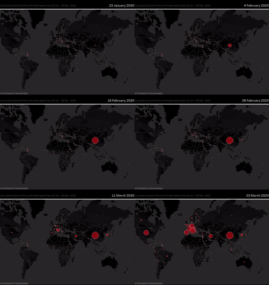
This section is relatively simpler. To create this visualization, you do not need a version of tableau which is 2020.1 or higher. The technique used to create this animated visualization is similar to the one displayed in the video in section C.1. However, there are some extra things that you will learn from this section especially, visualization using maps, formatting a map and size encoding. In this section, we will aim to visualize the total number of cumulative confirmed COVID-19 cases on a world map in chronological order. The tutorial is divided into two parts. In the first part, I will demonstrate how to create an animated world map and how to format the graphic. In the second part, I will discuss how we can package this visualization in the form of a nice dashboard and publish the graphic in tableau public and get a sharable link.
(E.1) Using Animated Maps to Visualize the Spread
This is the first part of the two-part tutorial on how to create an animated world map to visualize the COVID-19 spread. In this first video of this series, you will learn how to use maps for visualization and how to use animation to visualize the spread in chronological order. This video will help you learn and understand the following things:
- Using map to visualize geographical data. (00:30)
- Formatting the map. (00:40)
- Edit size (size encoding). (00:43)
- Add colour, border and transparency. (00:49)
- Create animation. (01:00)
- Format date. (01:05)
- Edit chart title. (01:13)
- Format chart title. (01:25)
- Play the animated plot. (01:32)
(E.2) Creating a Dashboard
In this final section, we will create a nice visual dashboard using the graphic we have created in the previous section. Finally, we will save and publish it in Tableau Public. From this final video of the ‘animated map’ series, you will learn how to:
- Open a new dashboard. (00:25)
- Choose a dashboard size. (00:35)
- Add plots to the dashboard. (00:41)
- Adjust plots to the dashboard. (00:48)
- Insert image in the dashboard. (01:15)
- Insert and edit a text in the dashboard. (01:59)
- Save a dashboard to tableau public. (02:53)
- Play the animation in Tableau public. (03:37)
- Interact with the plot. (04:14)
(F) End Notes
I hope you have enjoyed creating these graphics. If this was your first hands-on exercise on creating animated visualizations using tableau, then congratulations on that. Write to me about your experiences in the comment section. I hope you would continue to have fun in creating such visualizations and it is probably not difficult to identify the other applications of such animated visualization in some other domains. Also, remember that nothing is better than adding narration to such beautiful animated visualizations. A narration can enhance the beauty of these visualizations subsequently. Here is a wonderful example of story-telling using animated graphics. The person in this video is Professor Hans Rosling, a Swedish Professor of Global Health, and I am sure this video will make you fall in love with data visualization even more.
To the readers – If you would like me to evaluate your dashboards and give my personal feedback please post the links to your dashboards in the comment box. I will also be very excited to see your improvisations on these existing graphics. I also welcome you to post your creative ideas and anything new which you have created and would like to share in this forum in order to enlighten each other.


