Tableau is one of the most popular tools for data visualization. As a platform that allows Data Analysts and Data Scientists to portray data effortlessly, Tableau saves a lot of time by not having to code for every pixel of the information displayed.
In this tutorial, we will use the free version of Tableau to visualise data with an example. We will be using the state-wise crime in India Dataset. The data can be downloaded here.
Note :
In the example that follows, I have renamed the dataset as crimes_india.csv
Install Tableau Public
To begin with Tableau, you must install the Tableau Desktop application in your local machine. In this tutorial, we will stick to the free version of Tableau available called Tableau Public. You can download it here. Install the application in your system with the downloaded installer.
Let’s fire it up and do some visualisations!
Connecting To The dataset
After you fire up the Tableau Public application, you will be greeted with a homepage that has a Connect panel on its left side. The panel will have a hand full of options to connect to a variety of data sources such as excel, text, pdf and also live database servers.
Our dataset is a .csv file. So we will click on the ‘Text file’ option. Select the downloaded file and click open.

Once you click open, the data will be imported into the Tableau worksheet. On the Data Source page, we will be able to see the active connections and the data which we imported.

Before we proceed to visualisation, we need to solve a small discrepancy in the data. If you observe closely, in the SL.No column we will find invalid values such as Total (States), Total (UT) and Total(All India).
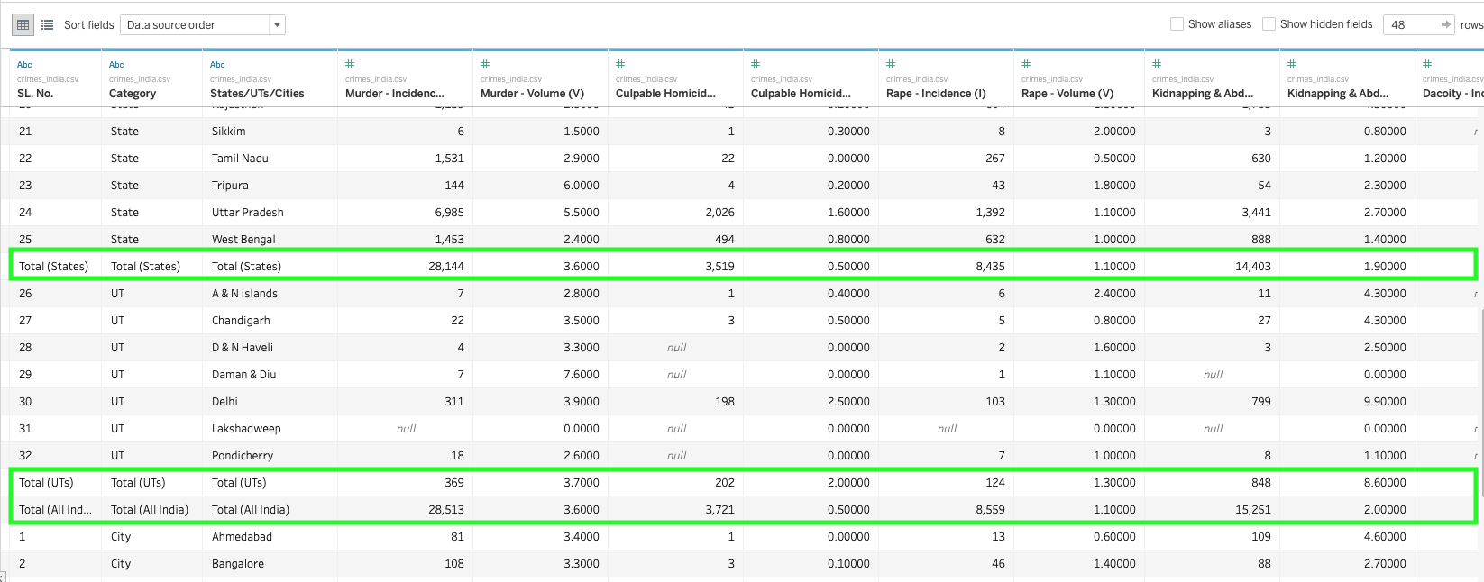
If we ignore these rows, it will mess up the numbers that we are going to visualise. For example, when Tableau aggregates the sum of a specific crime for the entire country, it will sum up all the rows including the ones shown above. We don’t need these rows for now so we will remove them from the data temporarily.
Adding Filters
How do we remove those rows temporarily? We can filter them out using the Tableau’s filters.
On the top right corner of the Data Source page, you will see a Filters section and an Add button. Click on the add button and a pop-up window will appear. Click on add and a new pop up will appear listing all the columns in the dataset. Select the column we want to filter data based on (SL.No. ) and click OK.

Once you click OK, yet another popup window appears with a list of all the values in the selected column (SL.No) and gives several filter options like General, Wildcard, Condition, Top.
- General lets you select specific values using the checkbox, you can either use the checkbox to select features or to exclude the checked features by checking the exclude flag at bottom right corner.
- Wildcard lets us add filters based on patterns in the data.
- Condition adds filters based on mathematical conditions or formulas.
- Top lets us select the Top or Bottom portion of the dataset based on conditions.
We will stick to the general filter for now. Check the exclude flag on and select the data we want to exclude from the dataset.

Tip: You can also use the wildcard filter to exclude all values containing the word Total.
Click OK and you will see the filter summary of how many rows have been selected from the total number of rows. Click OK again and the dataset will be refreshed.
Congrats, you have learned to add Filters in Tableau!
Let us now understand some of the most common data manipulation techniques in Tableau.
Data Types, Calculated Fields & Splits
Some of the most important techniques are within the head-band of the dataset. So let’s focus on it.

- Data Types: Changing the Data types of features in Tableau is as easy as selecting from a drop-down menu. On each column header, there is an option to change the data type. Abc specifies that currently the column is set to “String”. The globe stands for geographical data which is a speciality of Tableau that lets it identify geographical locations which will help in plotting maps. To change the data type click on the current data type (such as Abc, globe, # etc) to select a new type from the drop-down.

- Calculated Fields: Calculated Fields are very important when we are handling derivative data or Data that can be used to make calculations or derive a new feature. For example, calculating the total marks of 5 subjects represented in 5 columns.
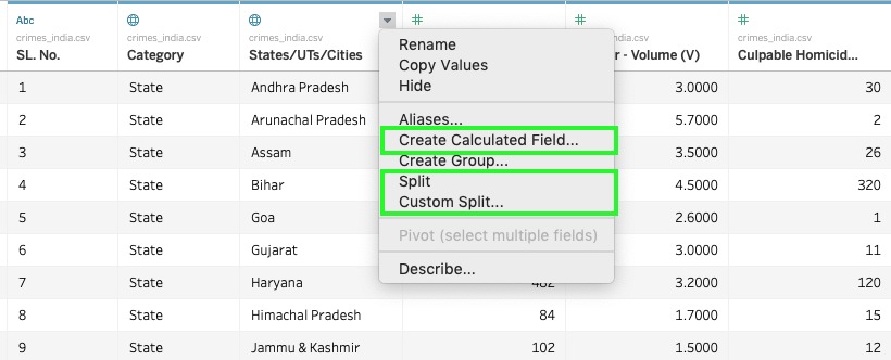
To create a calculated field click on the “Create Calculated Field” option. This will open up a calculation field where you can enter the criteria or formula for the new field.
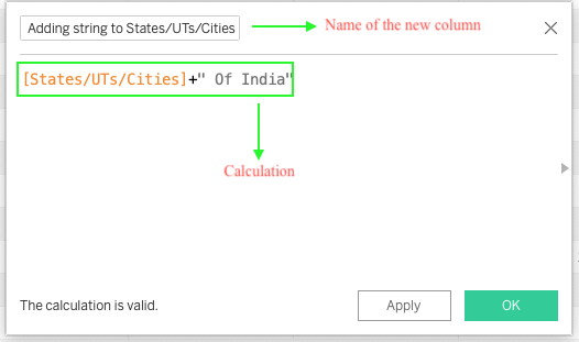
For example, let’s add a string “ Of India ” to all the values in the column States/UTs/Cities of the dataset and add it as a new column. To do this click on the drop-down from the column States/UTs/Cities “ and select create calculated field” option. On the upcoming window add the expression for the desired calculation. See the image below.
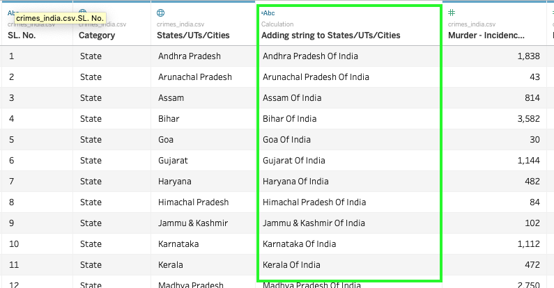
Once you click apply, you will find a new column in your dataset like what’s shown below:
Try doing some mathematical operations on the numerical features or columns!
- Splits: We can split the values in one column as different features. For example, let’s split the newly generated calculated field with the word “Of”. To do this select the drop-down menu of the column and select “Custom split” option. On the upcoming window choose the separator and choose whether to keep both sides of the split or either of it.

Once you click ok you will find 2 new columns at the end of the dataset as shown below.

We will now move on to visualisation. Delete all the three columns generated in the above examples by selecting the drop-down and clicking delete option.
Visualising Crimes In India
To open your visualisation worksheet click on the sheet 1 tab at the bottom left corner.
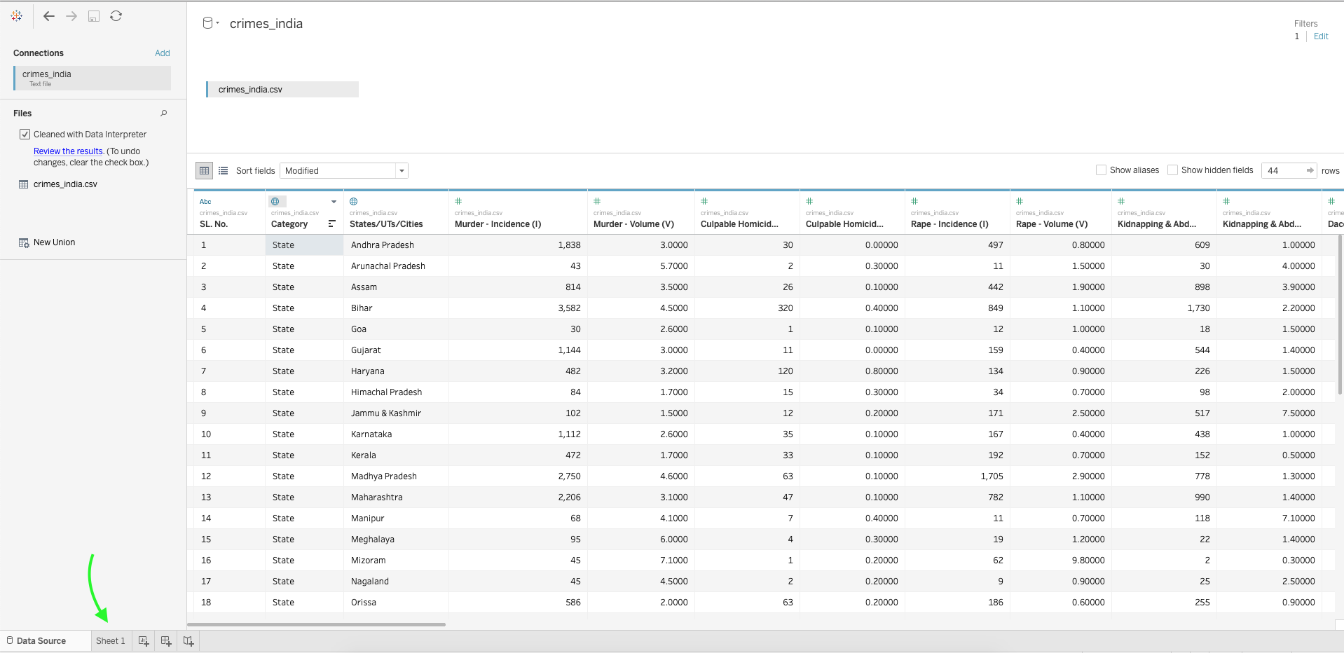
Tableau is a highly interactive GUI tool for plotting graphs and creating a beautiful visualisation, which means there is zero coding required. However, it also means that we are required to interact with the user interface to do our work. Creating visualisations in Tableau is basically all about dragging and dropping stuff. What you must know is what to drop and where you have to drop it.
Pay close attention to the image below and identify all of the highlighted parts because we will be using them more often while creating visualisations. Also, we will be mentioning these fields with their respective label or tag or name as <label or tag or name> Tab (eg. Marks Tab, Rows Tab, Columns Tab from the image)

Dimensions & Measures
Dimensions and Measures are Tableau’s way of distinguishing Categorical and Numerical features from the dataset.
- Dimensions are categorical features which are responsible for the different dimensions or axis in a graph.
- Measures are the continuous values that represent a datapoint which is plotted along an axis.
1. Bar Chart For State/UT/City Wise Burglary Incidents In India
Steps to Plot:
- Drag and drop the Category feature from the Dimensions tab to the Columns area.
- Drag and drop the Burglary Incidence feature from the Measures tab to the Rows area.
- To add colour to the graphs, drag the feature Category (or Burglary Incidence) to the Color button in the Marks Tab.
- Add label to the bars by dragging the feature Burglary Incidence into the Label button in the Marks Tab.

Note:
Tableau automatically aggregates data as a sum. This can be changed by selecting different criteria for aggregation from the drop-down menu of the selected measures.
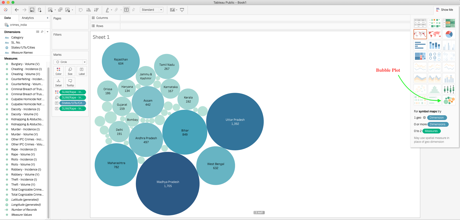
2. Bubbles Chart For Most Rape Incidents In India State/UT/City Wise
Steps to Plot:
- Drag and drop the States/UTs/Cities feature from the Dimensions tab to the Columns area.
- Drag and drop the Rape Incidence feature from the Measures tab to the Rows area.
- Select the Bubbles graph from the Show Me Tab
- To add colour to the graphs based on intensity, drag the feature Rape Incidence to the Color button in the Marks Tab.
- Add label for the count of Rapes in each state by dragging the feature Rape Incidence into the Label button in the Marks Tab.
3. Choropleth Plotting For Most Cognizable Crimes Under IPC State-Wise
Steps to Plot:
- Add filter for selecting only the states. You can add a filter in the visualisation worksheet by simply dropping the Category feature into the Filter Tab. Set the filter.
- Drag and drop the States/UTs/Cities feature from the Dimensions tab to the Columns area.
- Select maps from the Show Me Tab.
- Drag and drop the Total Cognizable Crimes Under IPC – Incidence (I) feature from the Measures tab to the Color button in the Marks Tab.
- Add label for the state wise count of Total Cognizable Crimes Under IPC by dragging the feature Total Cognizable Crimes Under IPC – Incidence (I) into the Label button in the Marks Tab.

A lot of data still remain unexplored and same goes for Tableau’s visualisation options. Tableau offers a variety of plots which can be used to make really attractive visualisations.
Try out different plots and choose the one that you think is both beautiful as well as informative.
Saving Your Progress
Unfortunately, Tableau Public does not allow users to save a local copy of the workbook that they made. Instead, you can save your work in Tableau cloud which is a public gallery for Tableau visualisations. You can save your visualisations in Tableau Public with File -> Save to Tableau Public option.
Closing Note
Tableau is an invaluable addition to a Data Scientist’s tool kit. Being on top of all the visualisation tools available at present Tableau is still growing both in popularity and in coming up with better and easier ways to demystify data.
Happy Visualising!!