Visualisations used to represent data are very valuable to understand the data easily and quickly. Data holds its power in making decisions only if you understand it entirely and visualisations give that understanding. Basically, data visualisation represents data in a logical, easy-to-understand way. It is better than information in plain text or numbers since it is easy to process visual information better than text.
Every kind of data problem calls for a specific kind of data visualisation tool. No one visualisation fits for all sorts of problems. Organising such visualisation isn’t easy, it requires a lot of prerequisite knowledge.
The greatest value of a picture is indeed that it forces us to notice what we never expected to see. We present a list of different visualisations and a guide to understand where to use which one.
Types Of Visualisations
1.Ring Chart:
Also called as a Multi-Level Pie Chart, the basic idea of this type of visualisation is to represent hierarchy though rings. Each ring corresponds to a hierarchy level. The central circle is the root node, followed by a classification of sublevels. And it uses one colour for one group of the hierarchy family. The angle of each slice of the chart is either divided equally under its parent node or can be made proportional to value. It becomes easy to recognise the multi-layered hierarchy using this chart. It is also called as Sunburst Chart, Ring Chart, Multi-level Pie Chart, Belt Chart and Radial Treemap.
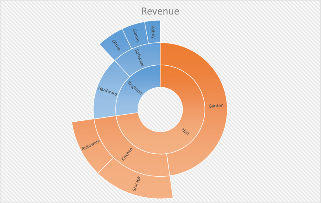
When to use: They are used for hierarchy related information and is best applicable to places where identifying which group is bigger than the other is important.
2.Treemap:
Treemaps are also used for hierarchical visualisation. Divided using rectangles, the sizes of these rectangles represent the quantity for each category. Each rectangle has a size according to the quantity assigned to it and with respect to other quantities. Also, the area size of the parent category is the total of its subcategories. If no quantity is assigned to a subcategory, then it’s area is divided equally amongst the other subcategories within its parent category.
When to use: Treemaps were invented as a way of visualising for large file directory, without taking up too much space. So it is easy to apply at places which need compact and space efficient representation and gives a quick overview of the structure. Treemaps are also great at comparing the proportions between categories via their area size.
3.Circle Packing:
Also called as circular treepar, they are used for hierarchy like a treemap, except that it uses circles in place of rectangles. Circles inside a circle represent the hierarchy. Each branch in a tree diagram is a circle and each sub-branch is represented by a circle inside this parent circle. Colour for categories and sizes for quantity. The same category groups may either be the same colour or could be nested within the same parent circle.
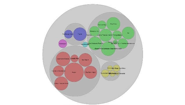
When to use: Used to reveal hierarchy and are better than Treemaps for representations. But it takes up more space.
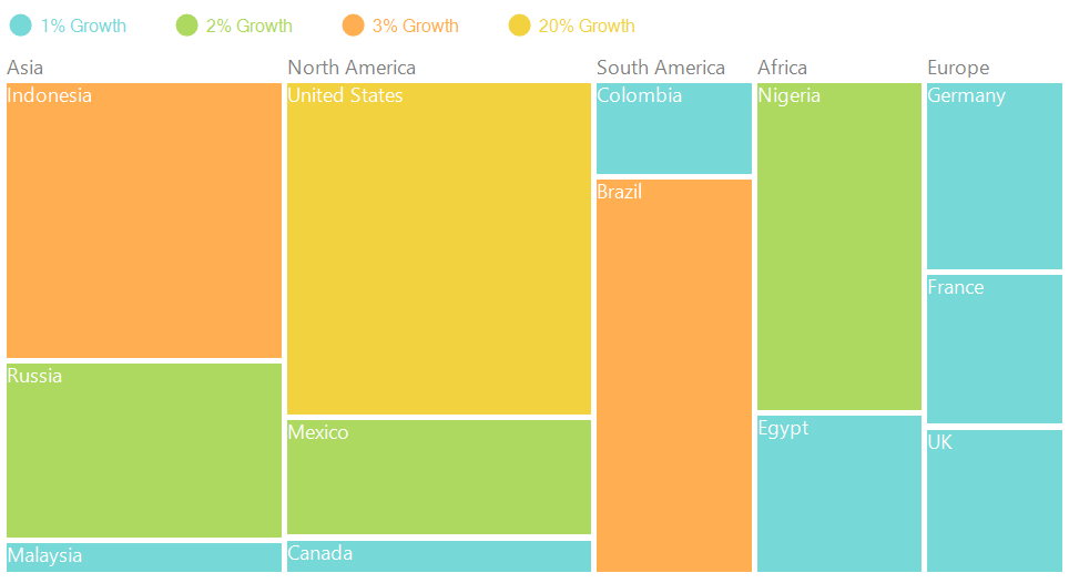
4.Marimekko Chart:
Also known as Mosaic Plot, they are used to visualise categorical data over a pair of variables. The width and height of segments are determined by percentage, in blocks. Because of their way of representation, it is easy for them to detect relationships between categories and their subcategories via the two axes.
When to use: They cannot be very useful when complicated dataset. These charts are used for representing a general view of the data.
5.Parallel Coordinates:
They are used to plot multivariate data and are useful to see the relationships between many variables together. Every variable is to be represented and compared are given their own axis, according to their values. These axes are placed parallel to each other. Plotting is nothing but links joining the values to be represented on these vertical group of axes. This means that each line is a collection of points placed on each axis, that have all been connected together. The order the axes are arranged in can impact the way how the reader understands the data. One reason for this is that the relationships between adjacent variables are easier to perceive, then for non-adjacent variables. So re-ordering the axes can help in discovering patterns or correlations across variables.
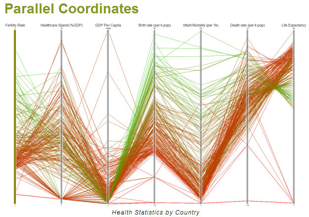
When to use: If there is a lot of data it becomes very difficult to understand this representation. Therefore, it is good to represent small datasets.
6.Slopegraphs:
Slopegraphs plot the change between two points. Quick rise and quick fall are easily detected. The two scales have the same maximum and minimum values, making it easier to see if the two groups increase or decrease or remain the same between the two categories.

When to use: Rate of change Slopegraphs generally require that values be available for each group and for each category to show the full extent of changes from one category to the other.
7.Radar Chart:
Also known as Spider Chart, Web Chart, Polar Chart and Star Plots, this tool is used to compare multiple quantitative variables. The axis starts from the centre and all the axis are arranged radially, at an equal distance from each other. Grid lines that connect from axis-to-axis are often used as a guide. Each variable value is plotted along its individual axis and all the variables in a dataset and connected together to form a polygon.

When to use: This visualisation is used to see which variables are scoring high and which ones are scoring low and are therefore best to see performance. If the dataset is large, it is very difficult to see the data, as a polygon inside the chart would make it very cluttered. Also, too much of data would need too many axes and too many axes would will make it look complicated. It is not very good for comparing values.
8.Horizon Charts:
These charts have one horizontal axis and are best used to represent negative values below the horizontal line. It shows the variation of parameters with respect to time and depicts a metric behaviour over time in relation to the baseline or horizon. Metric changes above and below a horizon for several data can be represented in one single chart, using this visualisation.
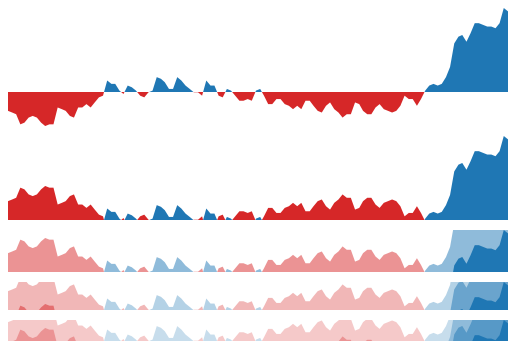
When to use: The best applications would be when the data has plenty of negative data, along with the positive.
9.Streamgraph:
This is to represent the size or proportion of groups over time. Also called ThemeRiver, it is a type of Stacked Area graph. It has values distributed around a varying central baseline, and change of data over different categories over time is seen. To do this, the charts use steam-like or river-like shapes. Size is each stream is proportional to the value in each category and the colours can be used for either different quantities or for different aspects in a quantity.

When to use: Streamgraph is suited o see trends and patterns. It is ideal for high volume data and should not be used at places where exact value is required. It is easier to depict major shifts in trends using this visualisation.
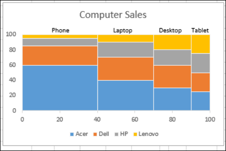
10.Stacked bar graph:
These graphs put their data in bars on top of each other. The total value of the bar is all the sub bars values added together. This type is to show comparisons between categories of data, but with the ability to break down and compare parts of a whole. Each bar presents the total and its sub-segments represent different categories of it.
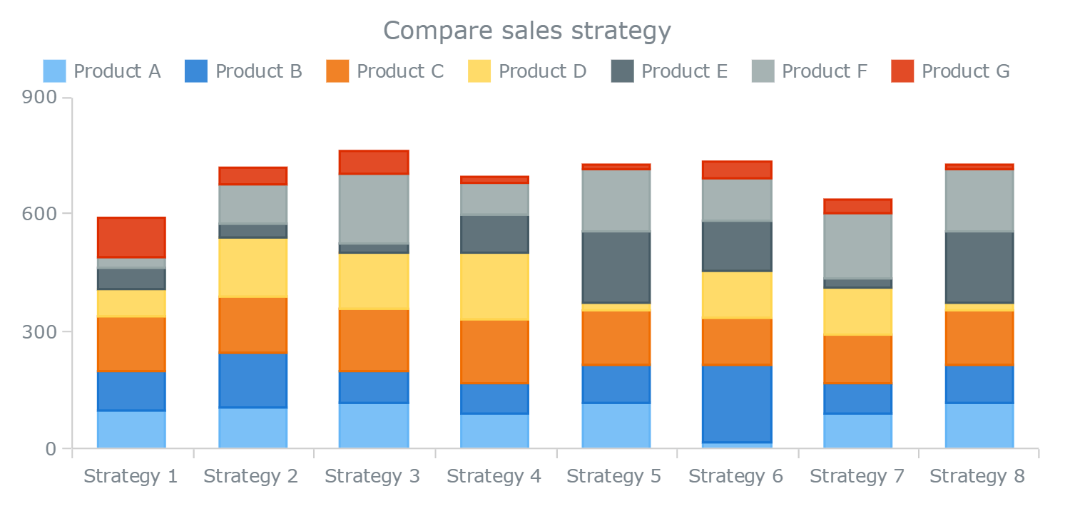
When to use: Ideal to see what relationship the small parts have on the total, or to compare the value of the small blocks over the total.
Outlook
Noted British data journalist David McCandless had famously said, “By visualising information, we turn it into a landscape that you can explore with your eyes, a sort of information map. And when you’re lost in information, an information map is kind of useful.” And it makes perfect sense for him to say that because visualisations do tell several stories that raw data does not tell.