An extraordinary amount of data passes through businesses on an ordinary day.
Data-driven insights are driving a new wave of business intelligence, helping move the needle with quick business impact.
However, with the increasing dependency and usage of analytics that is embedded into day to day decision making at enterprises, the demand for easily consumable and interactive data dashboards is on the rise.
Analytics dashboards have become critical in helping managers and executives make fast decisions. For these dashboards to be truly effective and impactful, the data insights need to be communicated using the best practices of design. But it should not stop there. Analysts need to communicate the data insights to the stakeholders with infectious passion and enthusiasm.
Here the importance of data storytelling emerges.
Storytelling has been a valuable tool that helped drive social cohesion for millennia, and this is permeating the seemingly abstract world of complex numbers and statistics as well.
Marrying data analytics with good storytelling has multiple benefits. With storytelling, stakeholders can more easily process complex business information that their data presents. Additionally, stories enhance memory, making it easier for the stakeholders to retain information. Stories are also known to induce the release of hormones oxytocin and cortisol – helping create a long-lasting impact on the audience. One estimate suggests that we can recall facts up to 22 times more effectively when they are part of a story as compared to when they are presented as isolated data points. Information presented in the form of a story also helps to reinforce our understanding and decipher patterns in complex data sets.
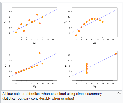
The human brain finds it difficult to make sense if numerous information is presented as raw data points or in close natural form. A famous example demonstrates the importance of graphical storytelling – the Anscombe’s Quartet, created by Francis Anscombe in 1973. The illustration displays four different datasets with almost identical variance, mean, the correlation between X and Y coordinates, and linear regression lines. However, the patterns are different when plotted on a graph.
Useful data visualization aids in human cognition of abstract data points by emphasizing analytical reasoning and using an interactive visual interface.
What Is Effective Data Storytelling?
By infusing data points with strategic creativity, they will become compelling, digestible and impactful. Our human brain loves a good story and finds it easy to grasp difficult concepts if they are summarized and presented in the form of a story. This is why fables and tales have always been such an essential part of our culture. The same applies to numbers, statistics and data science as well.
According to neurological research, when the user is shown a visualization of data, it takes just under 500 milliseconds for the human eye and brain to process the pre-attentive visual properties of an image. With the information overdose that we are subjected to in our daily lives today, well-narrated data stories with compelling visuals are vital in retaining attention and delivering maximum value to stakeholders.
Data storytelling is becoming a critical skill within the analytics industry – reflected in the rising demand for professionals with data storytelling skills.
Data storytelling results in improved insights that are not apparent with merely using descriptive and statistical methods, resulting in faster decision making. Using sound data visualization principles is an essential component of compelling data storytelling. John Tukey, the American mathematician and statistician, famously remarked; “The greatest value of a picture is when it forces us to notice what we never expected to see.”
However, care must be taken not to over-do the visuals. High cognitive load results when the visualization gets cluttered and the required effort to understand the message is too high. It will lead to your audience getting disengaged.
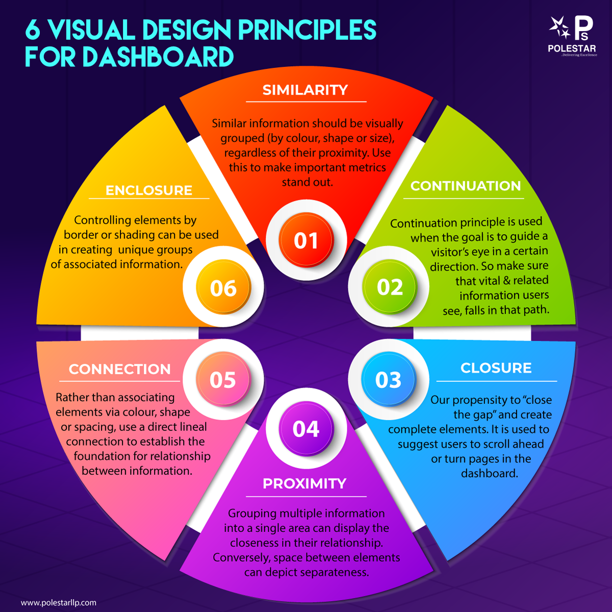
Using the pre-attentive attributes and contrast in size as well as colour will help to deliver a stunning visualization that gets its points across simplistically while reducing the cognitive load on the readers.
According to Colin Ware’s Information Visualization: Perception for Design, there are four pre-attentive visual properties:
- Colour
- Form
- Movement
- Spatial positioning
Strategically using these pre-attentive visual principles, and combining them with cutting-edge data-driven insights will create compelling and impactful data analytics for business stakeholders that will lead to increased adoption and improved Return on Analytics Investments.
Elements of Data-Storytelling
Certain elements need to be considered and deployed to deliver effective storytelling with data
- First, Understand The Stakeholders Expectations – Understand the user skill levels and their expectations, what KPIs they are tracking, what kind of analysis they want. Understand if they are interested in a deep drill down or a top-level reporting. Once you have understood the requirements and your user persona, you can begin crafting your story that best resonates with them.
- Set the context for your story – Context helps to explain the backdrop and set the mood for the story, helping elevate the user interest, bridge the gap, create interest and communicate your point of view more effectively.
- Define The Story Lifecycle – All stories have certain universal elements in common – characters, conflicts and redemption arc which help make the story engaging and impactful.
- Map The Story To The Visual – Next, once you have the character arc with you, choose the right visuals to tell the story. There is a helpful rule of thumb when selecting the charts and graphs on your dashboards. Treat each visualization as the answer to a question. The whole dashboard should also be the answer to a question which can be answered at a glance. Use principles of visual hierarchy to arrange and place visuals.
- Story delivery and walkthrough – Communicating the insights have to be more than merely pushing out information. Using infectious passion and energy to narrate the story will help to convey business outcomes and actions with necessary speed and impact. As author Anne Lindbergh shares, “Good communication is just as stimulating as black coffee, and just as hard to sleep after”
A Practical Test For A Good Dashboard
Ask your colleague to take a glance for 4-5 seconds and look away. Then, ask him what he can recall from the dashboard – what metrics & figures. The more effectively he can remember and communicate what he grasped from the dashboard – then it means that your dashboard served its purpose and it is good. If they cannot recall essential data points, then maybe your design is not simple enough to make effective communication.
Wrapping Up
While there are tonnes of visualization options available to the data professionals today, analysts need to deliver impactful data-driven analyses that are focussed on simplicity, effortlessness and reducing the cognitive load for the users. Data analytics has become a critical differentiator at top-performing organizations today. Hence, the need for data storytelling has emerged strongly. And, it will become even more important with time. By helping communicate powerful insights, data storytelling will help businesses capitalize on market opportunities – fast and help them remain ahead of the curve.