Data scientists mould data in various ways to unearth insights from it. And since these outcomes are used for decision-making, it is paramount for data scientists to write production-level code well. However, sometimes, the practices data scientists implement are tedious to utilise in production.
Data scientists often write code to evaluate the data by exploratory data analysis, check several data points, and outliers. These algorithms are only good for getting an idea about how data is spread, but are mostly purposeless in production.
Besides, the algorithms come back from the production team to data scientists for making changes in them to add features or optimise the code for improved efficiency. Such practices are cumbersome and ineffective in this highly competitive marketplace.
Now, with an app framework called Streamlit, data scientists can build machine learning tools right from the beginning of the project. Utilising Streamlit, data scientists can visualise their code output while analysing data. They can build ML tools that can be utilised to analyse data through clicks and sliding bars.
To demonstrate its capabilities, we have made a simple tool to visualise through bar graph using Streamlit.
We downloaded the data from Kaggle, which contains information about football players from the FIFA database.
In this small project, we will select two players of different teams and visualise their ranking, overall, and age in bar graphs.
Here are the steps to make you script to tool with Streamlit framework:
We have used sublime to write the Python code and used the anaconda terminal to run the Python file using streamlit run. This will open a server on your browser, where you can interact with the user interface.
Begin with installing and importing the Streamlit.
pip install streamlit
import streamlit as st
Note: We also imported other required libraries such as pandas, matplotlib, numpy.
Now just like any other data analysis project, you can proceed while utilising Streamlit methods.
While you can read the csv file into a pandas dataframe, it is recommended to do it with the below code when you are using Streamlit.
df = st.cache(pd.read_csv)("new_data.csv")
After reading the csv file, visualise the dataframe with the below code:
is_check = st.checkbox("Display Data")
if is_check:
    st.write(df)
Note: If in case, it doesn’t show the data, you can refresh the tab.

Now, to create a field to input values, add this code in the Python file and refresh your tab.
teams = st.sidebar.multiselect("Enter clubs", df['club'].unique())
st.write("Your input clubs", teams)
You will witness a field, where you can select from the drop-down, or type in the names of teams.
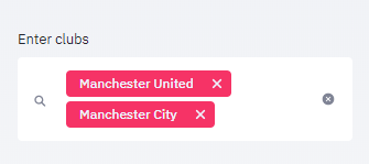
Here, we have entered two teams: Manchester United and Manchester City
Next, to enter the attributes we want to compare we will input the variables.
variables = st.sidebar.multiselect("Enter the variables", df.columns)
st.write("You selected these variables", variables)
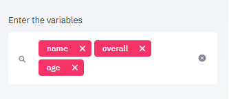
Using the team name and variables we provided, we can further subset the data to only focus on the information we need
selected_club_data = df[(df['club'].isin(teams))]
two_clubs_data = selected_club_data[variables]
club_data_is_check = st.checkbox("Display the data of selected clubs")
if club_data_is_check:
    st.write(two_clubs_data)
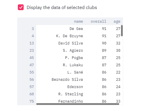
Eventually, we can input the name of the players to visualise their attributes.
selected_players = st.sidebar.multiselect('Select players to compare', two_clubs_data.name.unique())
st.write("The players are", selected_players)
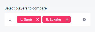
Now, we can further trim down the data to get details of only these two selected players
plot_data = two_clubs_data[(two_clubs_data['name']).isin(selected_players)]
st.write(plot_data)
Visualising the ranking of the two players
st.bar_chart(plot_data.name)

Finally, to visualise through a bar graph.
n = 2
values = plot_data.values
value1 = values[0][1:]
value2 = values[1][1:]
index = np.arange(2)
width = 0.3
p1 = plt.bar(index, value1, width)
p2 = plt.bar(index+width, value2, width)
plt.xlabel("Variables")
plt.ylabel("Value")
plt.xticks(index, ('Potential', 'age'))
plt.legend(values[:,0])
st.pyplot()
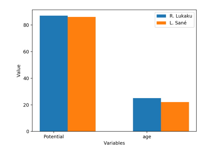
We can further add more variables and players to make the visualisation complex by making little tweaks in the Python code, but this will help you get started with the Streamlit.
You can read the documentation and implement other methods for making an intuitive machine learning tool here.


