

|
Listen to this story
|
A dashboard is a sort of graphical user interface that frequently enables quick access to key performance indicators (KPIs) related to a certain goal or business activity. In other contexts, “dashboard” refers to a “progress report” or “helps to summarize the progress” and is a type of data display. Dashboards can help company leaders save time and make better decisions by giving this overview. In this article, we will be creating and deploying dashboards in python with the help of Streamlit.
Table of contents
- About Streamlit
- Creating a dashboard
- Deploying a dashboard
Let’s start by having a brief introduction to Streamlit.
About Streamlit
Streamlit is a free, open-source, all-Python framework that allows data scientists to easily construct interactive dashboards and machine learning web apps with no prior knowledge in front-end web development. If you know Python, you’ll be able to utilize Streamlit to develop and distribute web apps in hours, not weeks. Streamlit is a free toolset for creating innovative dashboards.
Benefits
- Everyone who understands Python can use Streamlit. There are no HTML or CSS requirements.
- It has a diverse set of UI components. It includes practically every standard user interface component, such as a checkbox, slider, collapsible sidebar, radio buttons, file upload, progress bar, and so on. Furthermore, these components are quite simple to utilise.
- It supports a variety of interactive visualisation libraries, including Latex, OpenCV, Vega-Lite, and others.
Drawbacks
- While not difficult, learning Streamlit’s syntax takes some time.
- Streamlit is not very adaptable. It is exclusively Python-based, has a restricted number of widgets, and does not connect with Python Notebooks.
- The maximum data upload size is 50Mb.
- There is just limited video/animation support.
Are you looking for a complete repository of Python libraries used in data science, check out here.
Creating a dashboard
Let’s start by installing the Streamlit.
! pip install streamlit -q
Import some necessary libraries for data reading, manipulation and visualization
import pandas as pd
import numpy as np
import warnings
warnings.filterwarnings('ignore')
import plotly.express as px
Reading data and preprocessing for the visualization
df =pd.read_csv("Real-Time_Traffic_Incident_Reports.csv")
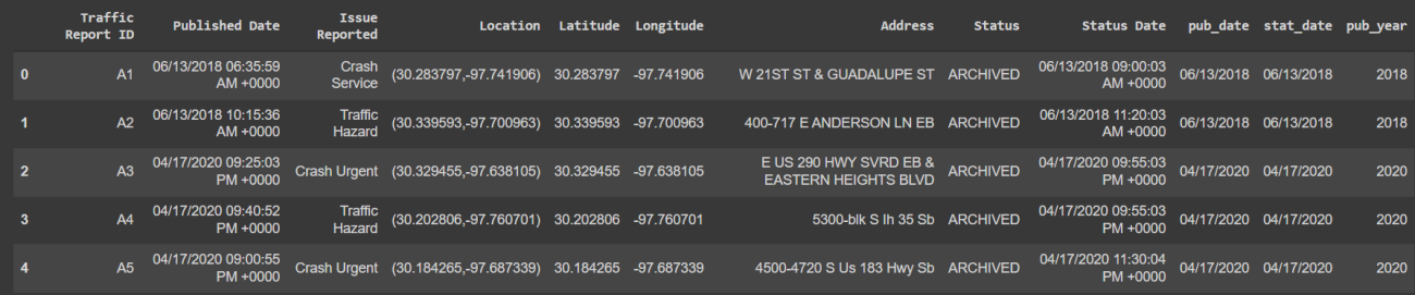
df[:8]

The data is related to the crime so it has the ids of the reports, the time and date when the crime happened and the categorization of the crime. Let’s clean the data and extract the date and year from the data for visualization.
df_utils=df.dropna(axis=0)
df_utils.reset_index(drop=True,inplace=True)

a=df_utils['Published Date'].str.split(" ")
b=[]
for i in range(0,len(a)):
 c=a[i][0]
 b.append(c)

d=df_utils['Status Date'].str.split(" ")
e=[]
for i in range(0,len(a)):
 f=d[i][0]
 e.append(f)

g=df_utils['pub_date'].str.split('/')
h=[]
for i in range(0,len(a)):
 f=g[i][2]
 h.append(f)

df_utils['pub_date']=b
df_utils['stat_date']=e
df_utils['pub_year']=h

df_utils[:5]
The data is ready to be used for the visualization part. Before that let’s create a python for the web application. This web application file will be used by streamlit to host the dashboard on the local server. This article is based on google colab python notebook so it would be different from the local runtime kernel.
%%writefile app.py
This line of code will create a python file named ‘app’ and ‘%%writefile’ will overwrite all previous versions of app.py with the new. We are using this so as to save time and energy by not editing one by one. The above code would be as it is, just copy-pastes it and escape all the printing codes. So the code will look like this.
%%writefile app.py
import streamlit as st
import pandas as pd
import numpy as np
import plotly.express as px

df = pd.read_csv("/content/drive/MyDrive/Datasets/Real-Time_Traffic_Incident_Reports.csv")
df_utils=df.dropna(axis=0)
df_utils.reset_index(drop=True,inplace=True)
a=df_utils['Published Date'].str.split(" ")
# for publish date
b=[]
for i in range(0,len(a)):
 c=a[i][0]
 b.append(c)
#for status date
d=df_utils['Status Date'].str.split(" ")
e=[]
for i in range(0,len(a)):
 f=d[i][0]
 e.append(f)
df_utils['pub_date']=b
df_utils['stat_date']=e
g=df_utils['pub_date'].str.split('/')
h=[]
for i in range(0,len(a)):
 f=g[i][2]
 h.append(f)
df_utils['pub_year']=h
The app file is now updated with preprocessed data. Let’s write code for the dashboard front end.
st.header("Real-Time Dashboard")
chart_selector = st.sidebar.selectbox("Select the type of chart", ['Pie chart','Bar chart'])
col1, col2 = st.columns(2)
If you know about HTML tags and elements it would be a lot easier for you to understand the streamlit code. The tag will create a header for the page in this article it is “Real-Time Dashboard ”. Similarly, the sidebar component will create a dropdown menu and the user can select from the options.
The column component will divide the output screen into as many columns as one defines. Here we have used just two columns. There are a whole bunch of HTML and CSS components that could be used to modify the dashboard.
So according to the option selected from the dropdown menu, we need to display the charts accordingly. Let’s create some charts and update the application file.
if chart_selector=='Pie chart':
  pie_chart = px.pie(df_utils, values='pub_year', names='Issue Reported')
  col1.plotly_chart(pie_chart,use_container_width = True)
else:
  bar_chart = px.histogram(df_utils, x="Issue Reported", color="pub_year")
  col2.plotly_chart(bar_chart,use_container_width = True)
Deploying a dashboard
The application file is ready to be deployed on the local server. As in this article google, colab notebook is used so things will be different from the local runtime hosting. Generally for hosting on colab ‘Ngrok’ is used which is a bit complex but there is an easier solution ‘local tunnel’. In this article, the ‘local tunnel’ will be used for hosting the application.
! streamlit run app.py & npx localtunnel --port 8501
This will download the local tunnel and create a web link for the streamlit application. For every execution of this code, it will generate a new link.
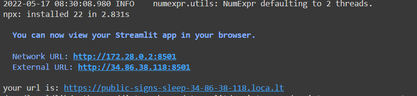
Once the URL is generated click on that and it will redirect to a warning page which warns about the phishing since one can duplicate any web app and host that app. The page will look something like this.

Just click on the button which says ‘Click to Continue’ and the streamlit web application will be loaded. Sometimes it takes time depending on the size of the data, internet connection, etc. Here is an example of how the above dashboard looks.

Final words
Streamlit is simple to use and gives good results, although it is only intended for basic programmes. Multi-page apps with complicated layouts are not really meant for it, which is understandable. With this article, we have understood how to design a dashboard and deploy it on a server with the help of Streamlit.